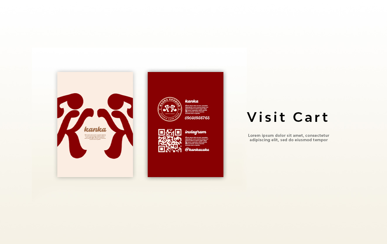
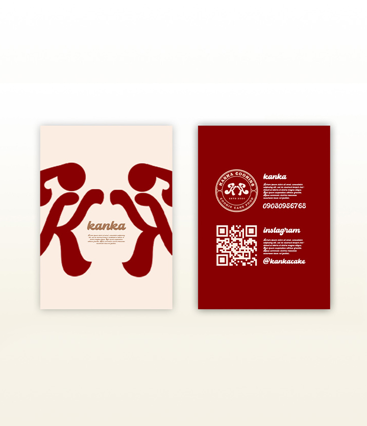
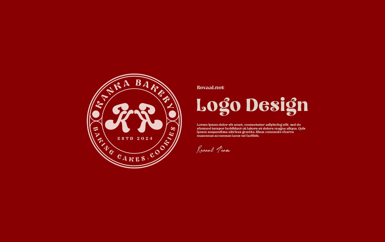
Kanka Bakery
Business Card
- Category Graphic Design - Business Card
- Client Mrs. Smith
- Start Date 20 July 2025
- Handover 25 September 2025
Sweet connections through design
We designed charming business cards for Kanka Bakery, owned by Mrs. Smith, that perfectly capture the warmth and artisan quality of their baked goods. The cards feature a delightful design with hand-drawn illustrations of wheat stalks and baking tools that immediately communicate the bakery's craft. We used a warm color palette of golden yellows and soft browns that evoke freshly baked bread and create an inviting, appetizing feel. The cards are printed on textured paper stock that mimics the feel of parchment, adding a tactile element that reinforces the handmade, artisan nature of the bakery. Each card includes essential contact information presented in a friendly, easy-to-read format along with the bakery's logo and a tempting tagline. We also added a subtle pattern of flour dust texture in the background that adds visual interest without overwhelming the design. eye to create a site that was visually engaging and also optimised for maximum performance. It also perfectly reflects the journey to help it tell a story to increase its understanding and drive action. To create a site that was visually engaging for maximum performance.
- + Brand Development
- + UX/UI Design
- + Front-end Development
- + Copywriting
- + Shopify Development
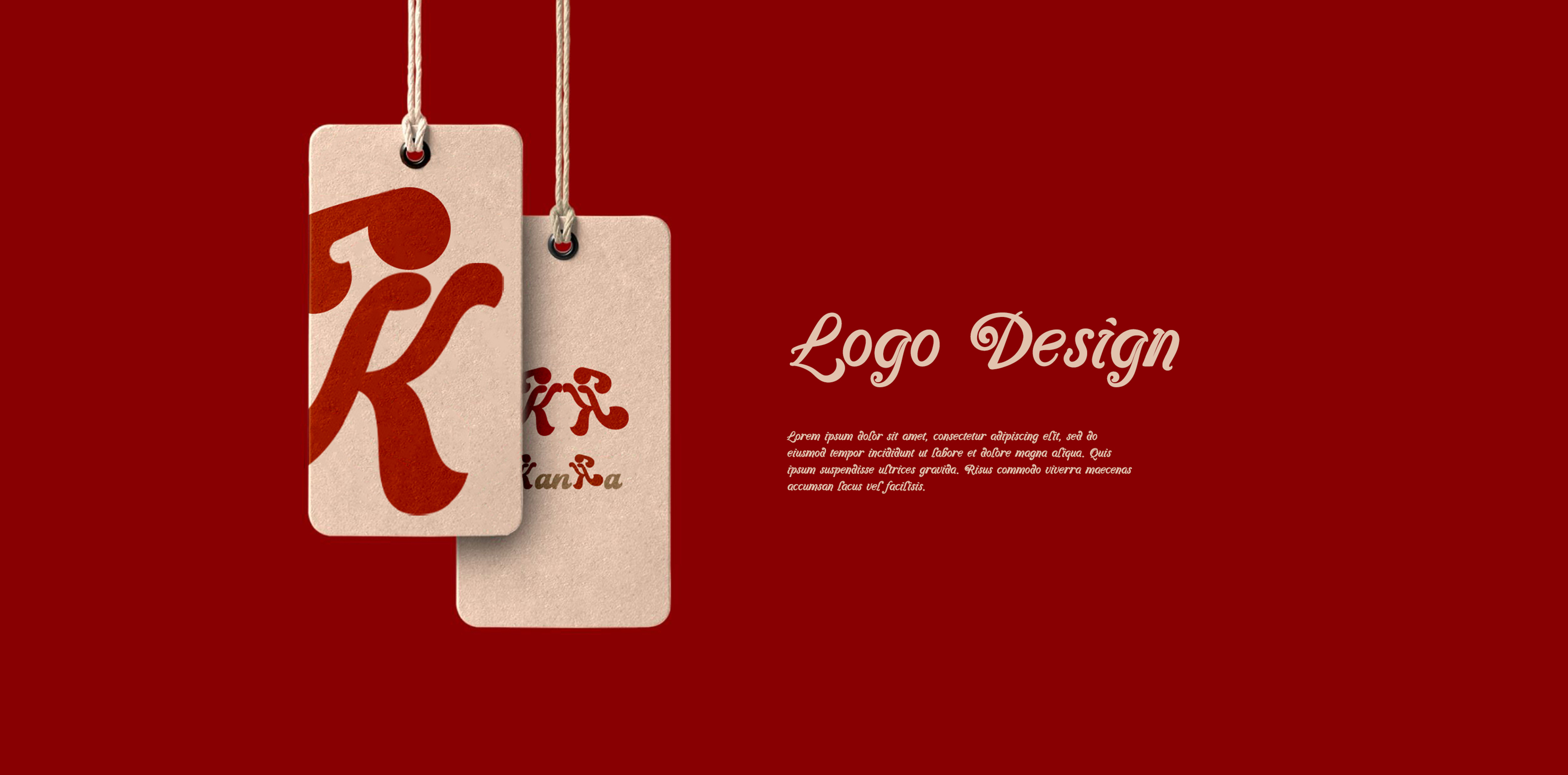
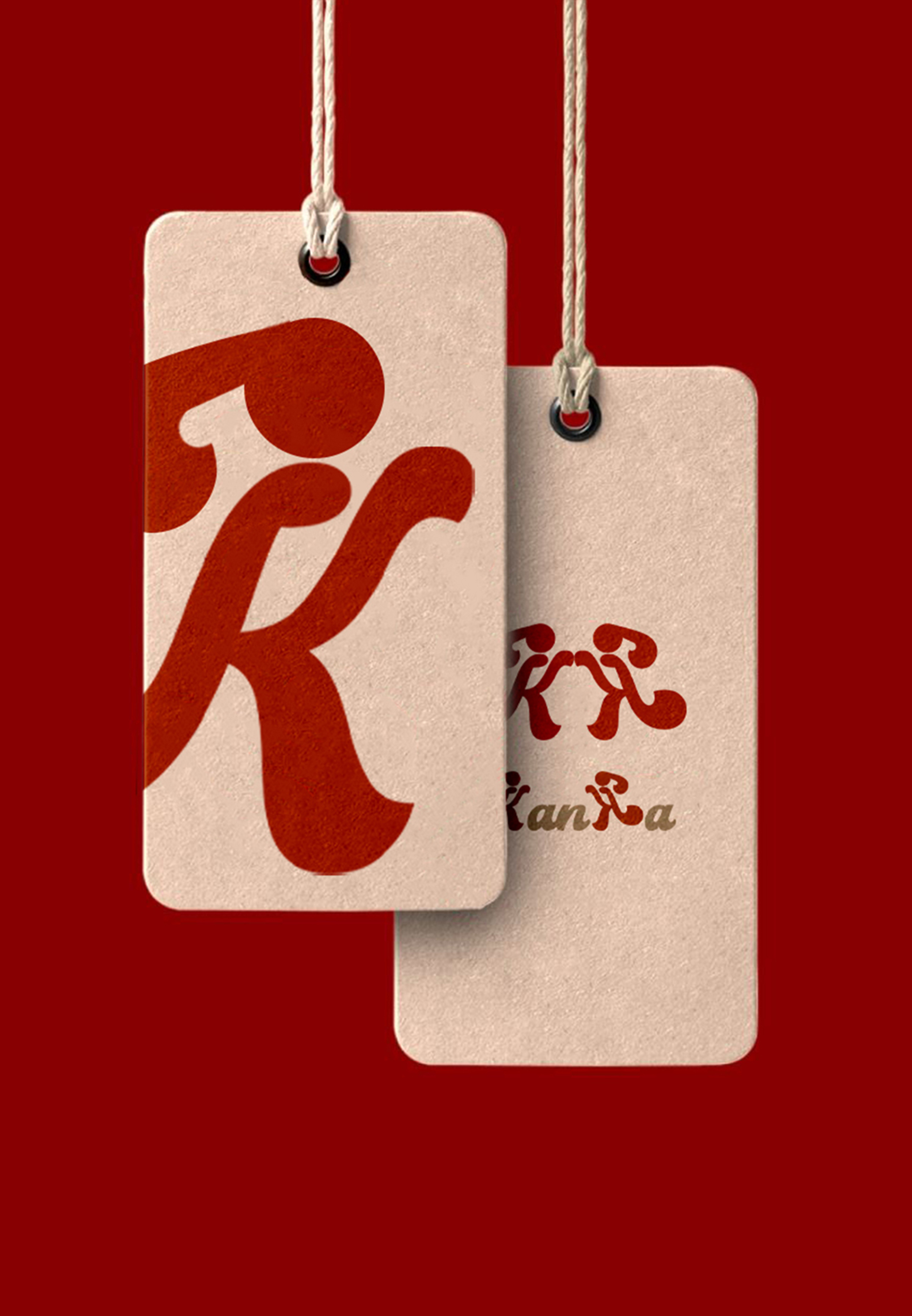
Visual and typograpy hierarchy
Visual hierarchy is the principle of arranging elements to show their order of importance. Designers structure visual characteristics—e.g., menu icons—so users can understand information easily. By laying out elements logically and strategically, designers influence users’ perceptions and guide them to desired actions. Users notice larger elements more easily can convert.

- regular This is text message
- Medium Medium typography
- SemiBold Just Amazing
- Blod Awesome