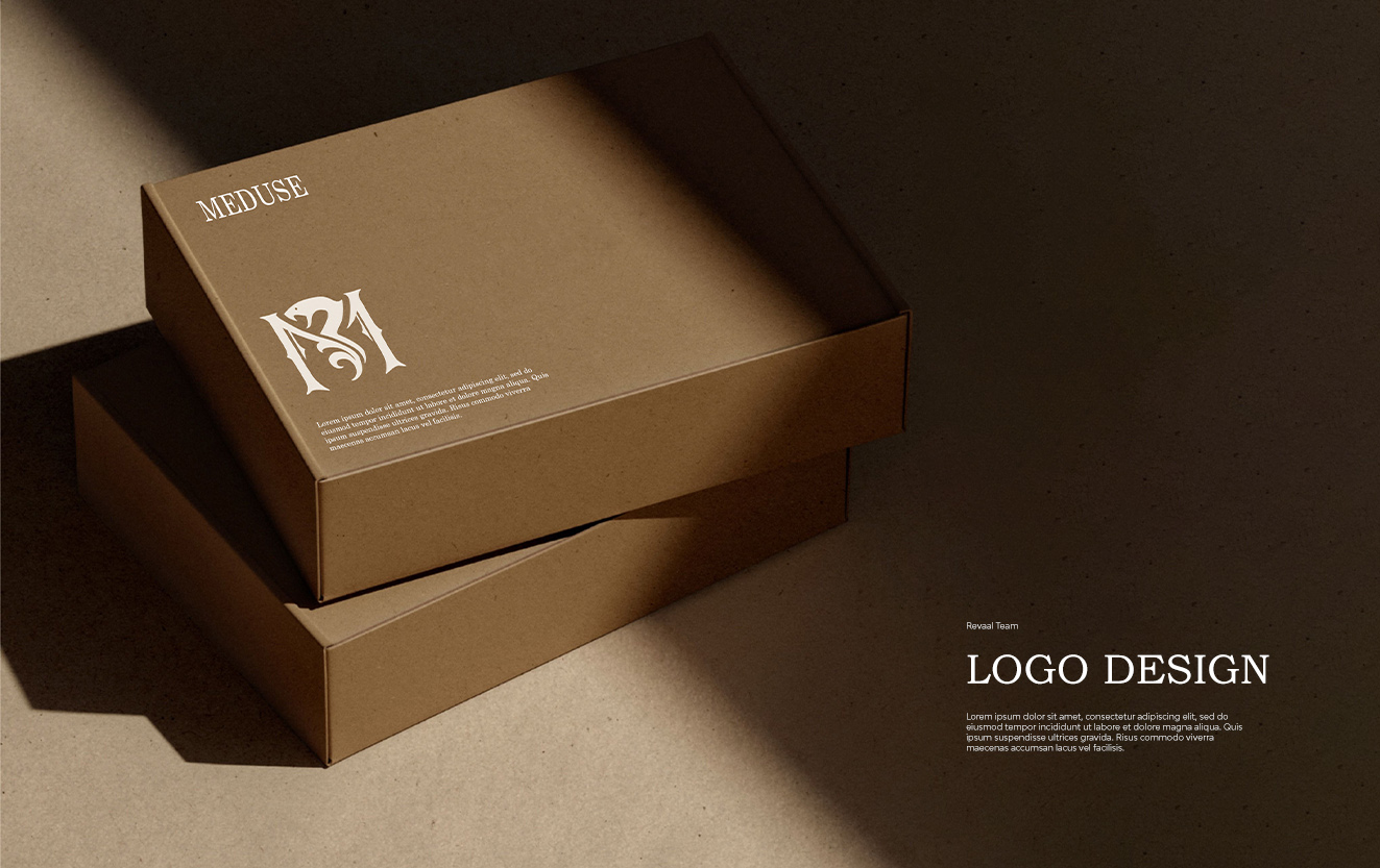
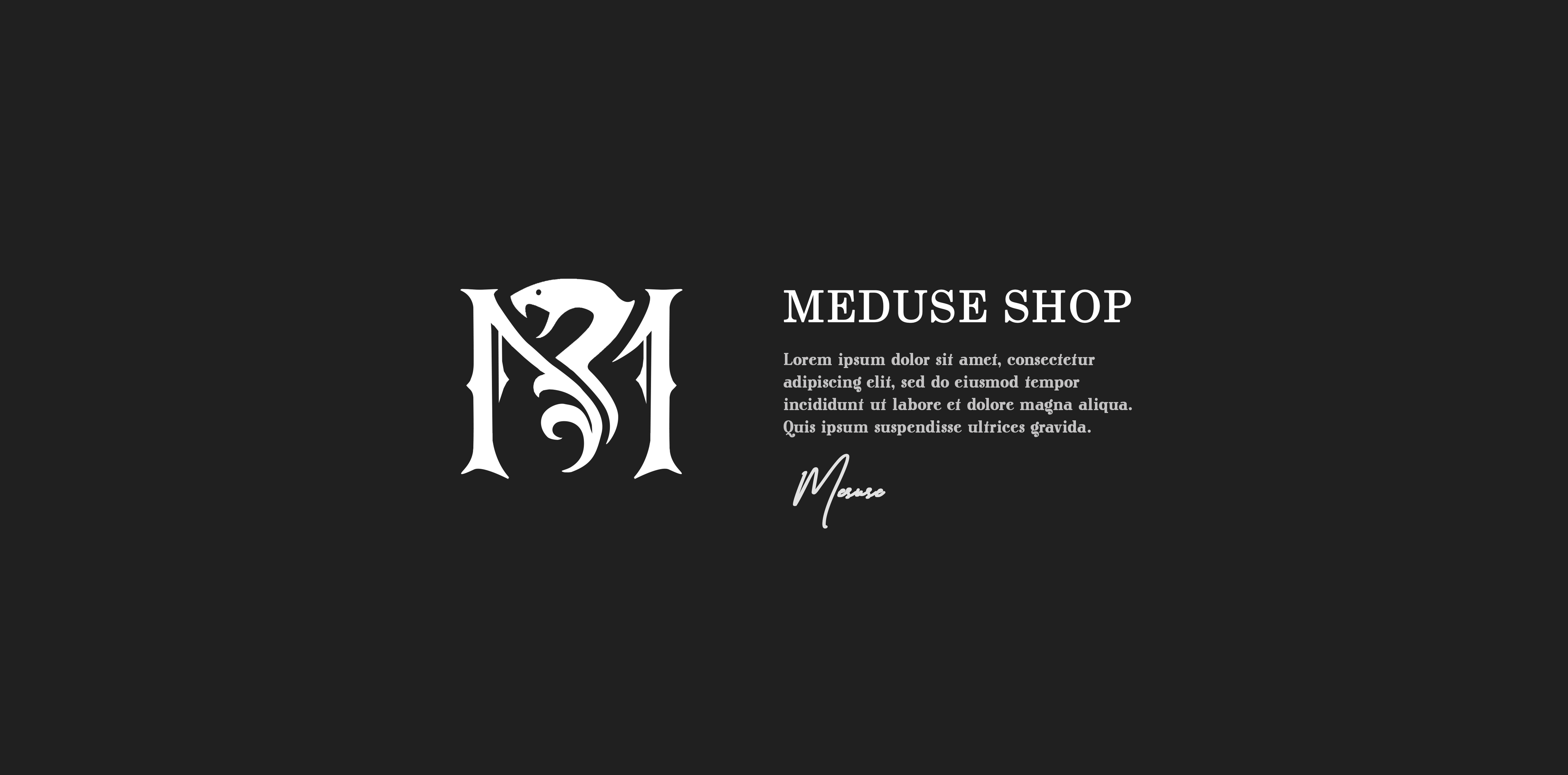
Meduse Clothing
Business Card
- Category Graphic Design - Business Card
- Client Ms. Mohadese
- Start Date 20 October 2024
- Handover 25 December 2024
Fashion meets elegant simplicity
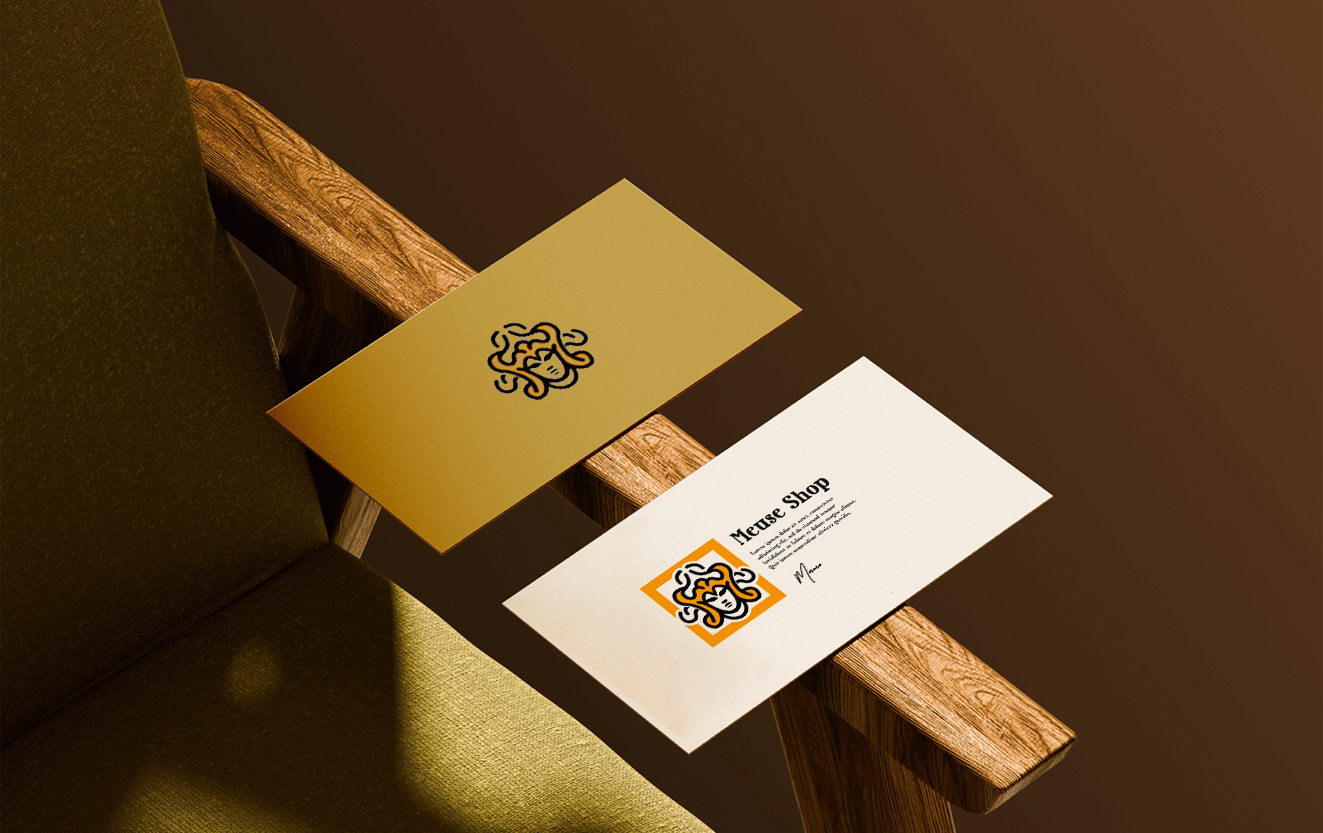
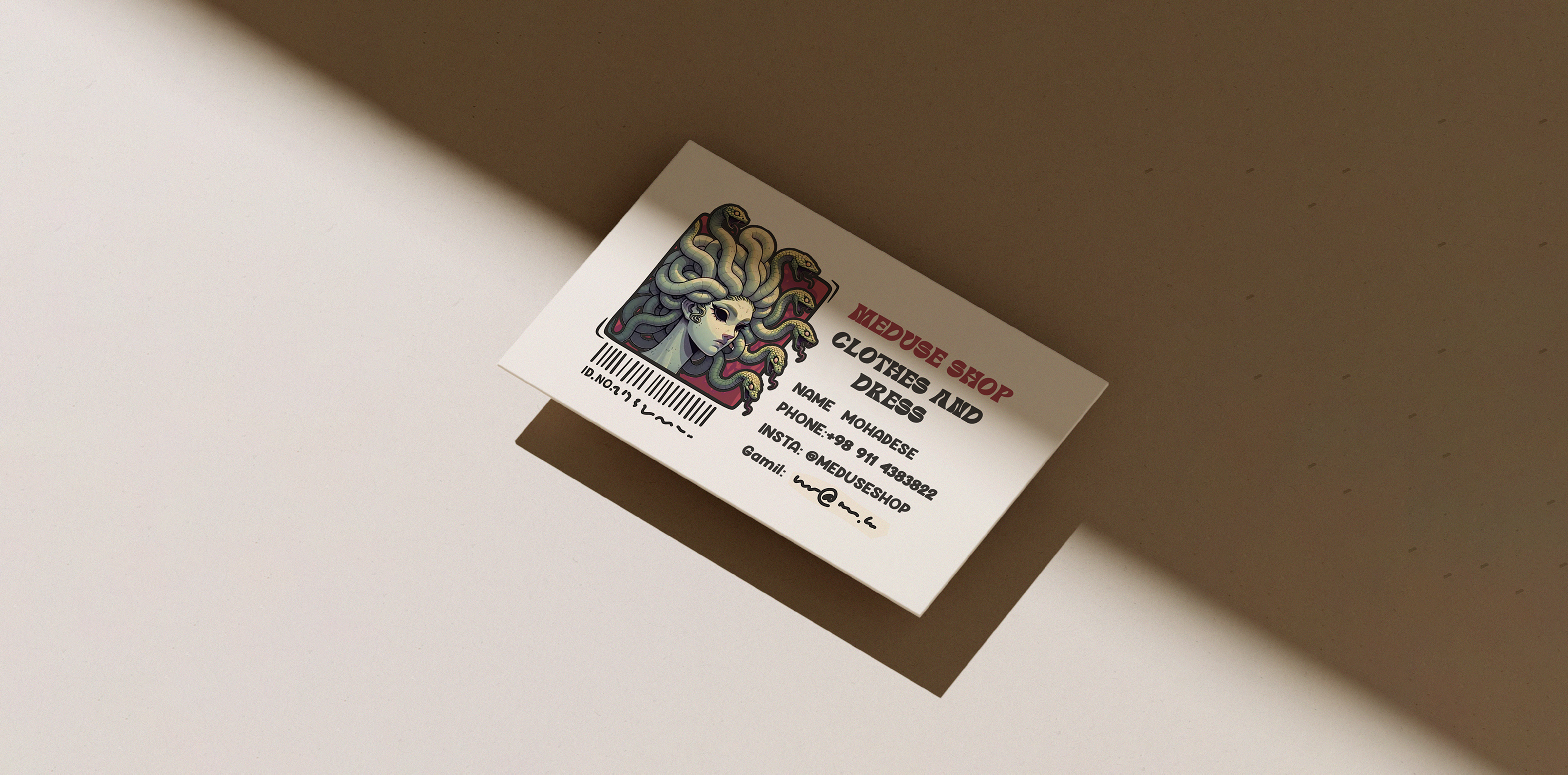
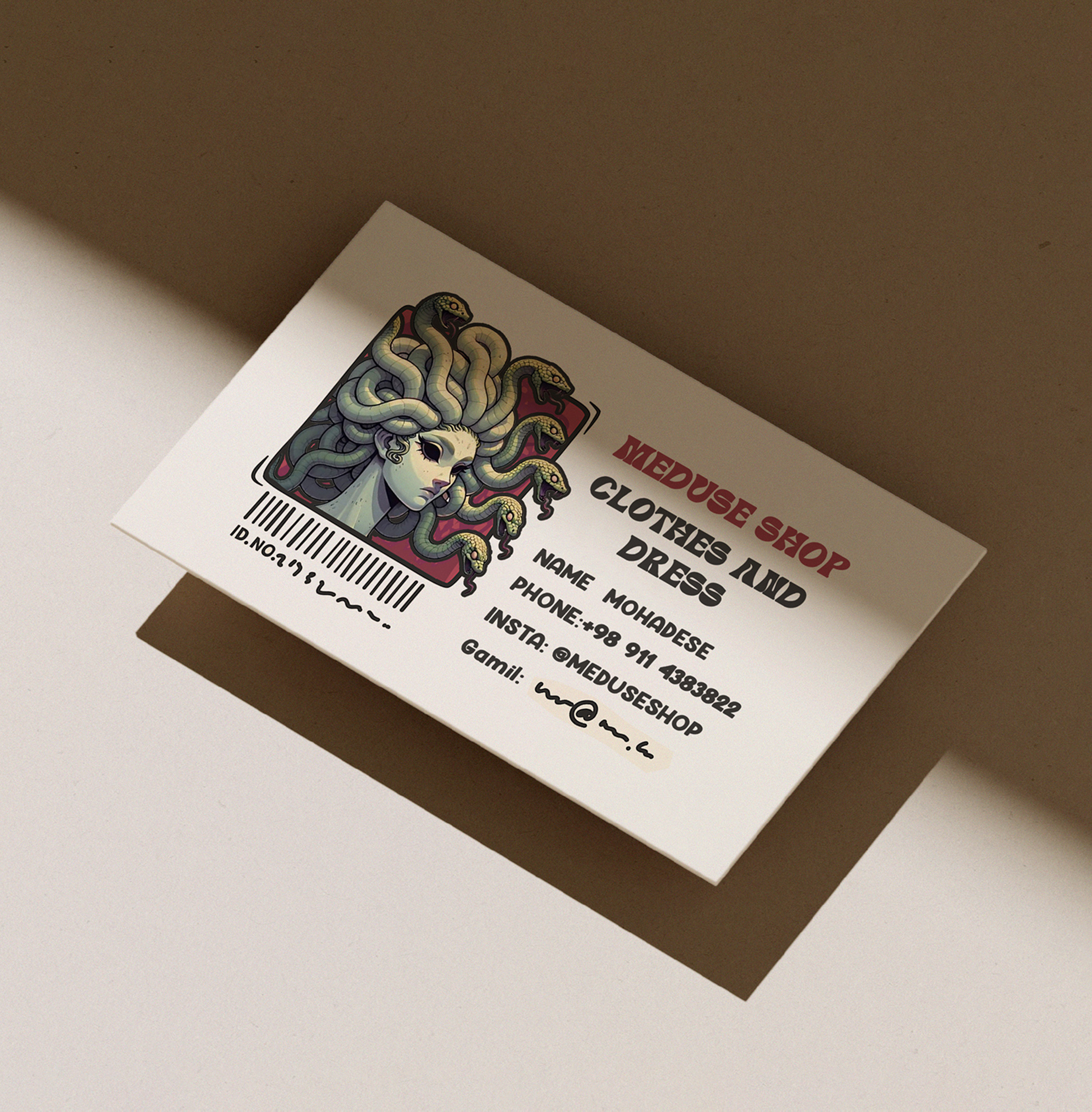
We designed sophisticated business cards for Meduse Clothing, owned by Ms. Mohadese, that capture the elegance and contemporary style of the fashion brand. The cards feature a minimalist design with a focus on premium materials and refined aesthetics that reflect the quality of Meduse's clothing line. We used thick, textured cardstock with a soft-touch lamination that creates a luxurious tactile experience, making the cards memorable from the first touch. The design incorporates the Meduse logo in a subtle embossed finish that catches light beautifully, adding depth and sophistication without overwhelming the clean layout. We chose a monochromatic color scheme of deep charcoal and crisp white that conveys timeless elegance and allows the brand name to stand out prominently. The typography combines a fashion-forward serif font for the brand name with a clean sans-serif for contact details, creating visual hierarchy while maintaining readability. Each card includes carefully selected contact information presented in an organized, easy-to-read format that prioritizes professionalism and accessibility.
- + Minimalist Design Approach
- + Premium Textured Cardstock
- + Soft-Touch Lamination
- + Embossed Logo Finish
- + Monochromatic Color Scheme
- + Fashion-Forward Typography
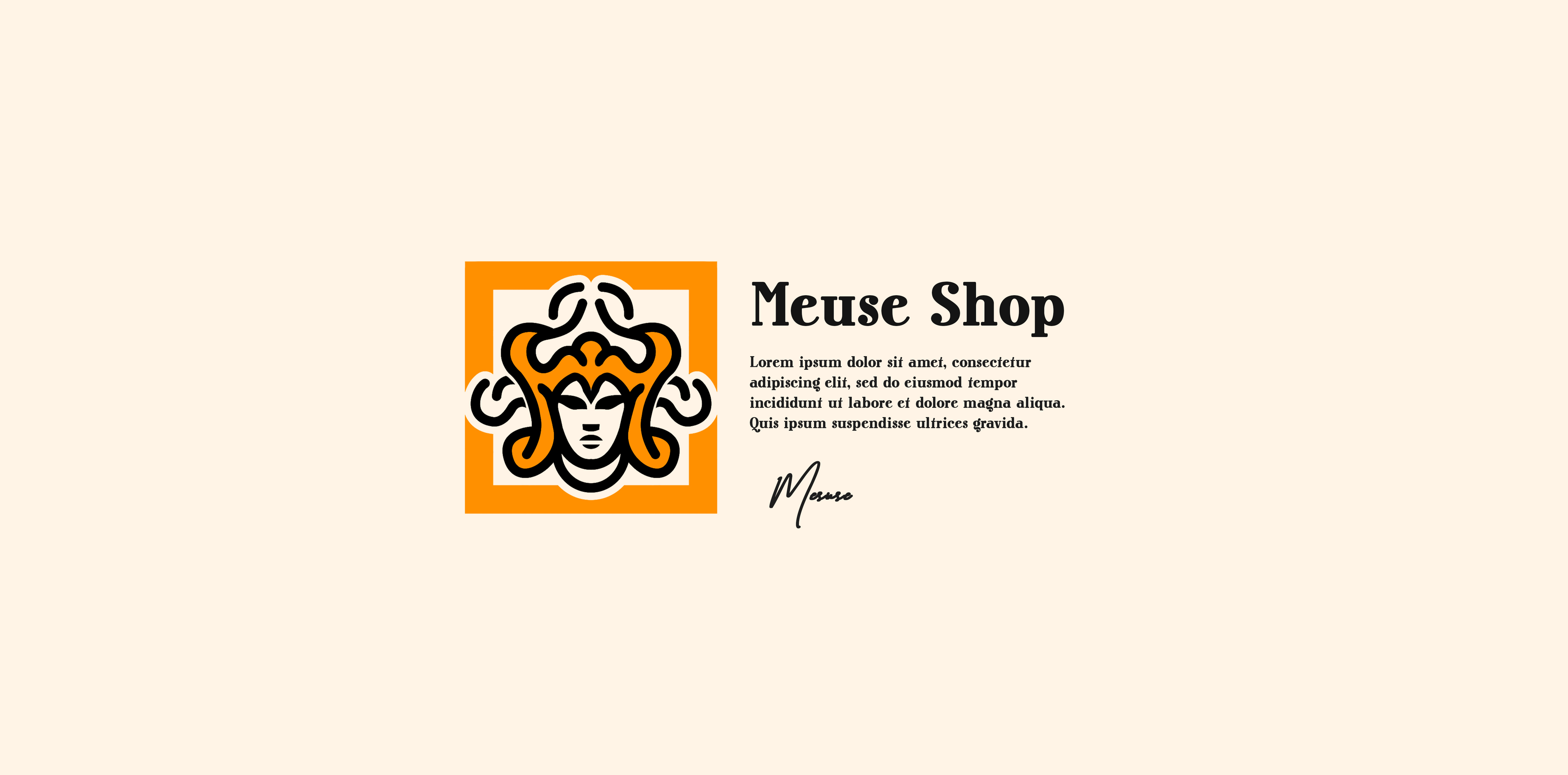
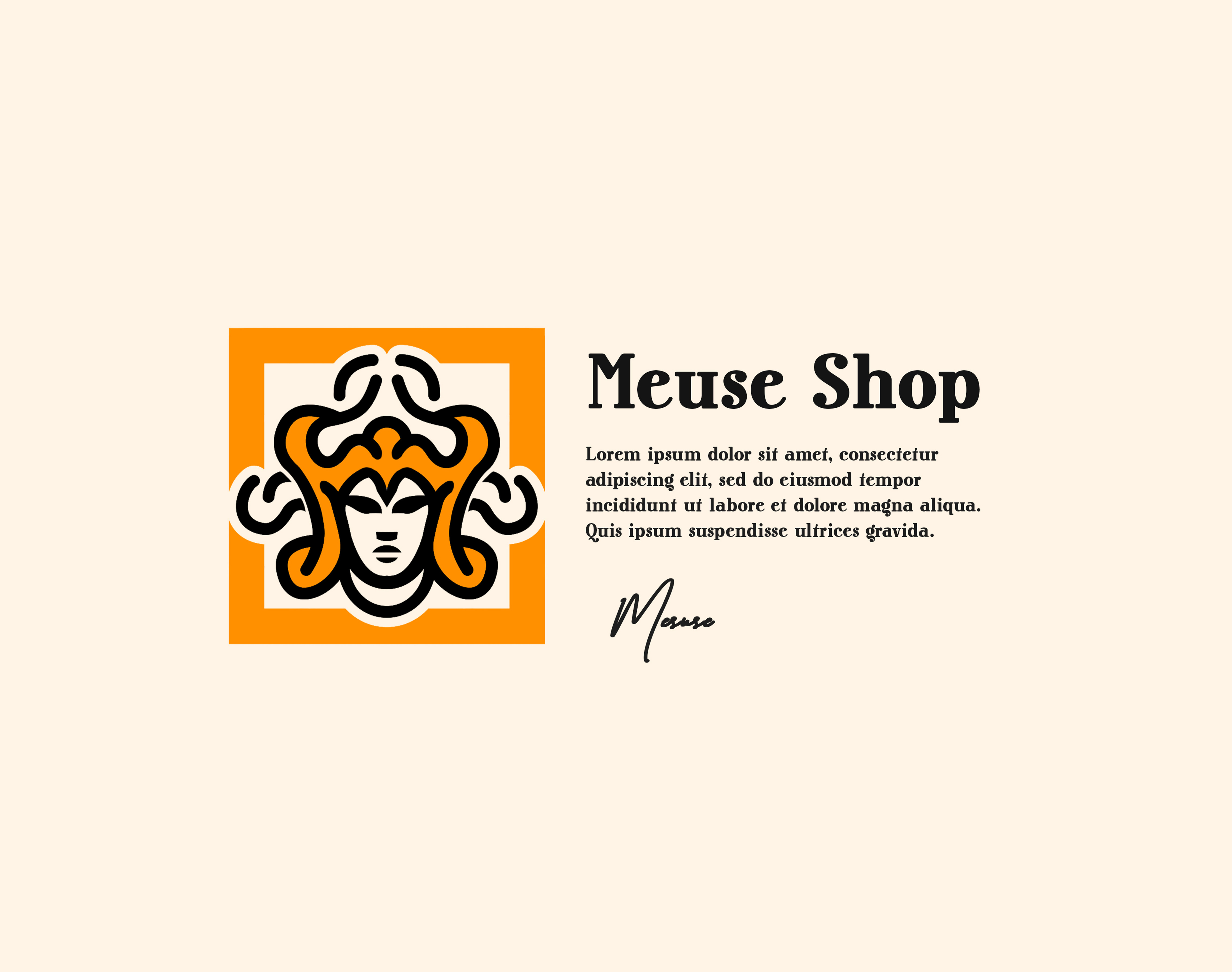
Visual and typograpy hierarchy
Visual hierarchy is the principle of arranging elements to show their order of importance. Designers structure visual characteristics—e.g., menu icons—so users can understand information easily. By laying out elements logically and strategically, designers influence users’ perceptions and guide them to desired actions. Users notice larger elements more easily can convert.

- regular This is text message
- Medium Medium typography
- SemiBold Just Amazing
- Blod Awesome