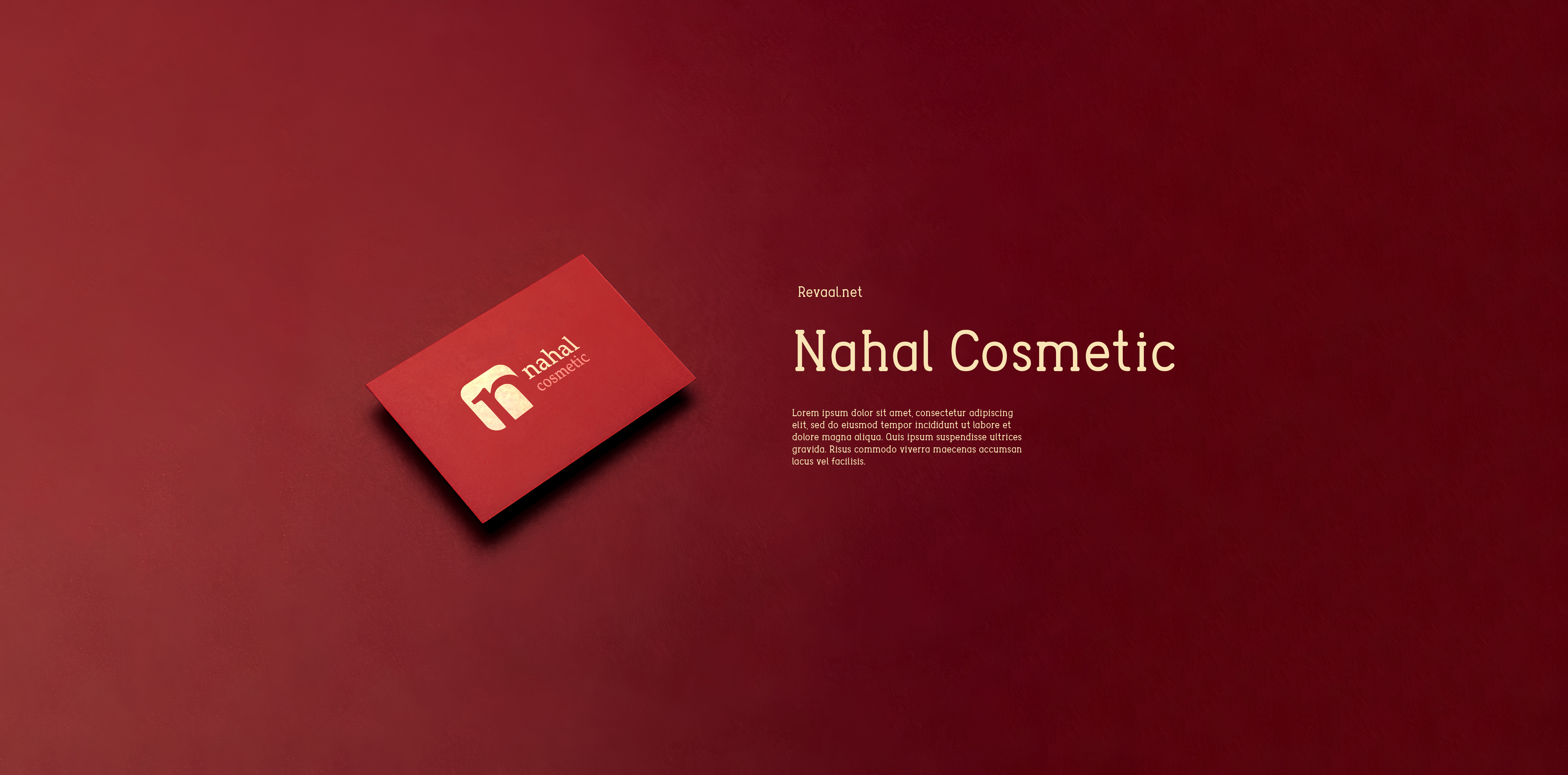
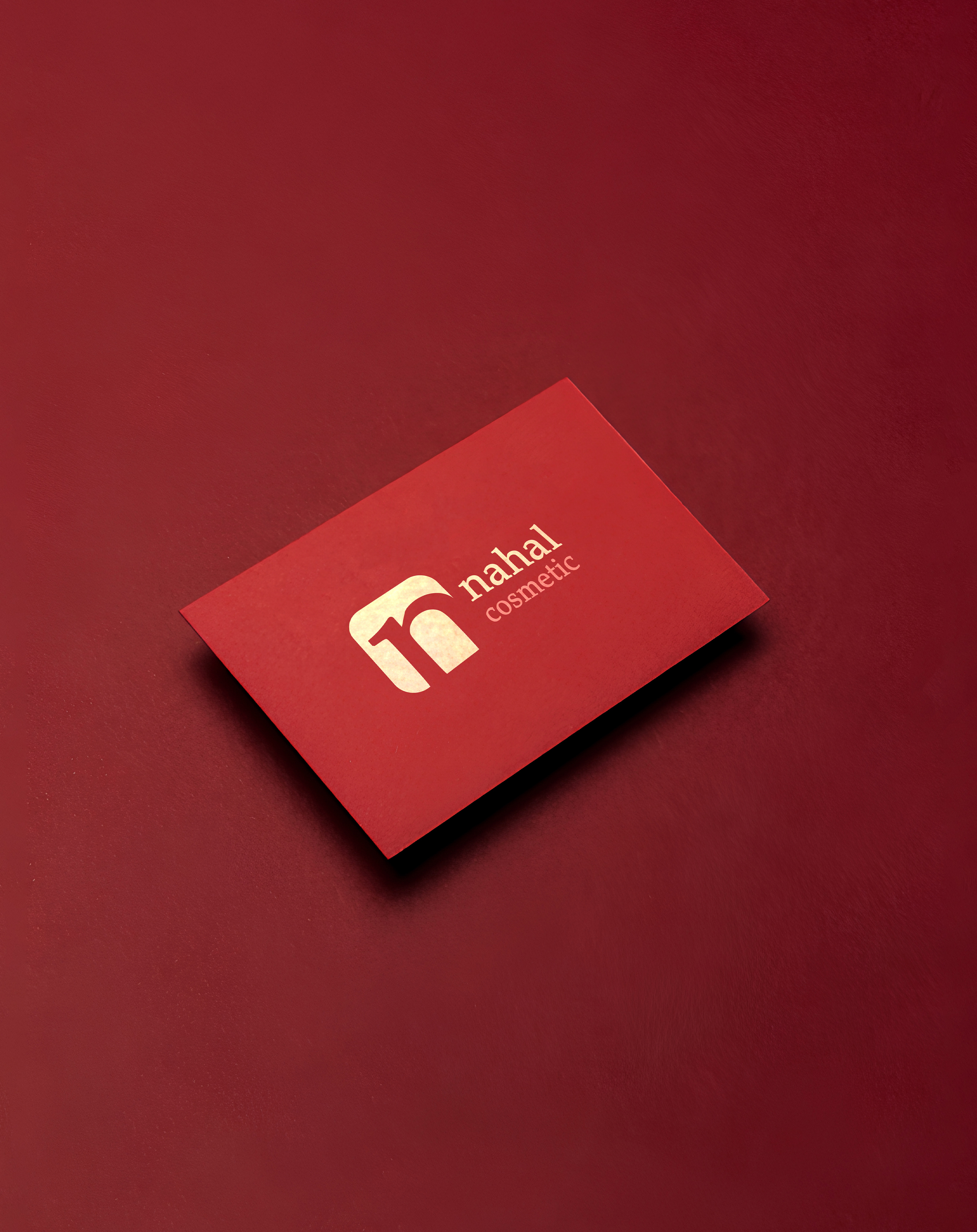
Nahal Cosmetics
Card & Packaging
- Category Graphic Design - Branding & Package
- Client Mrs. Azizpur
- Start Date 20 December 2024
- Handover 25 February 2025
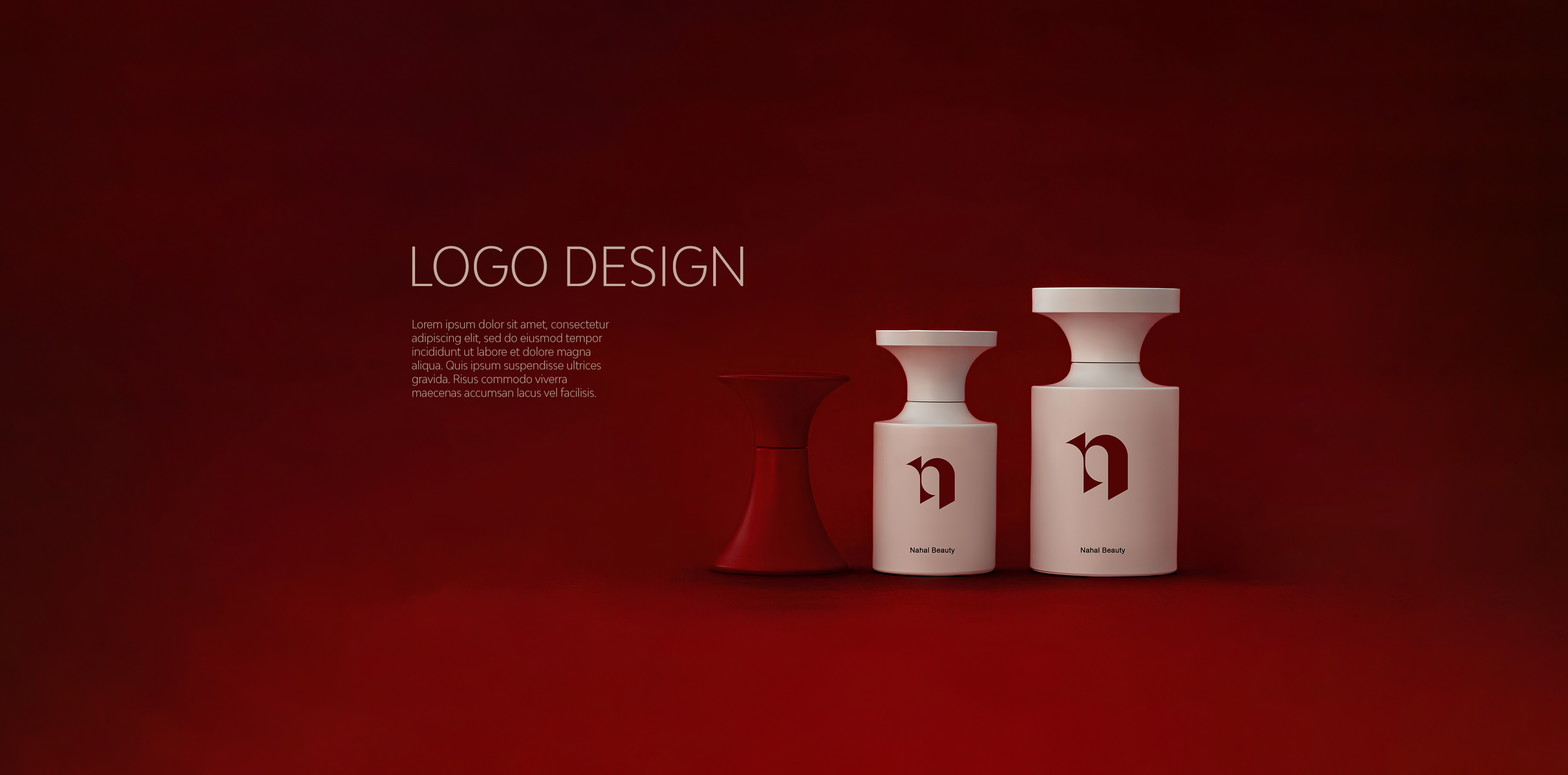
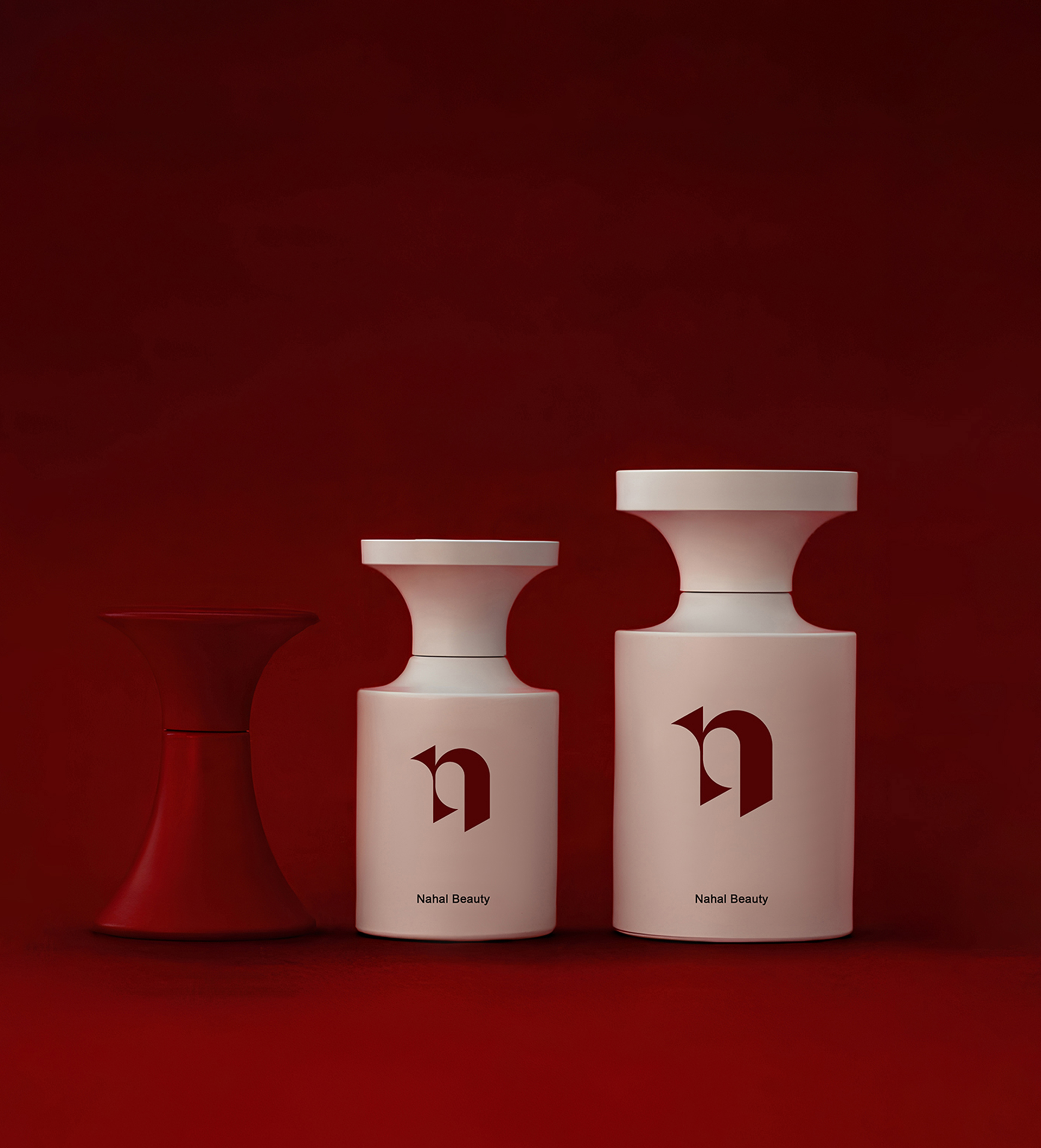
Beauty brand identity that captivates
We developed a comprehensive branding package for Nahal Cosmetics, owned by Mrs. Azizpur, that positions the brand as a premium beauty destination. The business card design features an elegant minimalist layout with soft rose gold foil accents that catch the light beautifully, creating an immediate impression of luxury and sophistication. We created custom packaging for their cosmetic product line that uses high-quality matte white boxes with embossed logo details and magnetic closures that provide a satisfying unboxing experience. The packaging system includes various sizes for different product categories, from small lipstick boxes to larger skincare sets, all maintaining consistent brand aesthetics. We incorporated a delicate floral pattern inspired by Persian art as a subtle background element that adds cultural depth while maintaining modern appeal. The color palette combines soft blush pink, warm cream, and metallic rose gold tones that evoke femininity and elegance. Each package includes a thank-you card with beauty tips and product information, enhancing customer engagement and brand loyalty.
- + Premium Business Cards
- + Luxury Cosmetic Packaging
- + Rose Gold Foil Stamping
- + Embossed Logo Details
- + Persian-Inspired Patterns
- + Multi-Size Package System
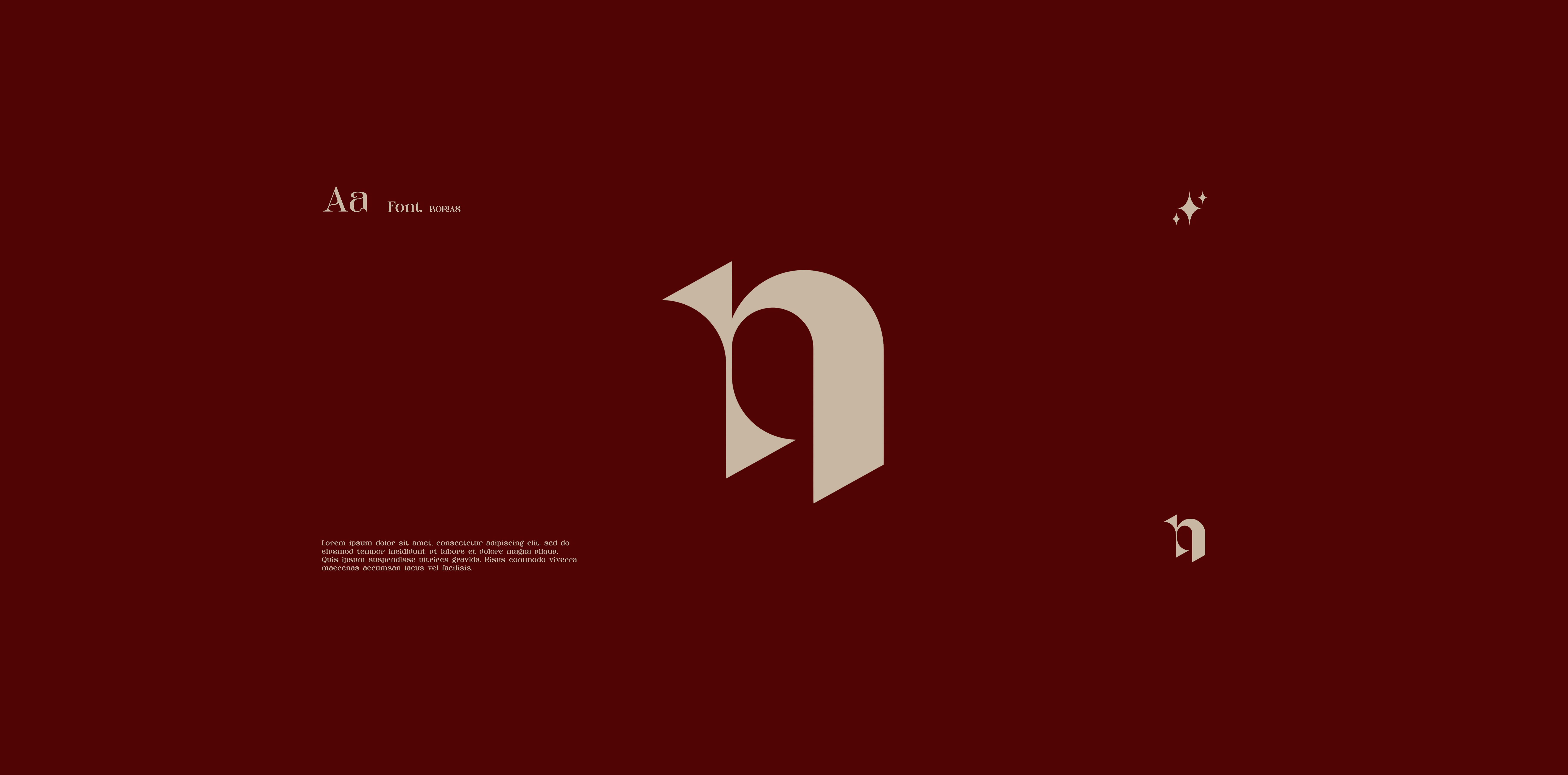
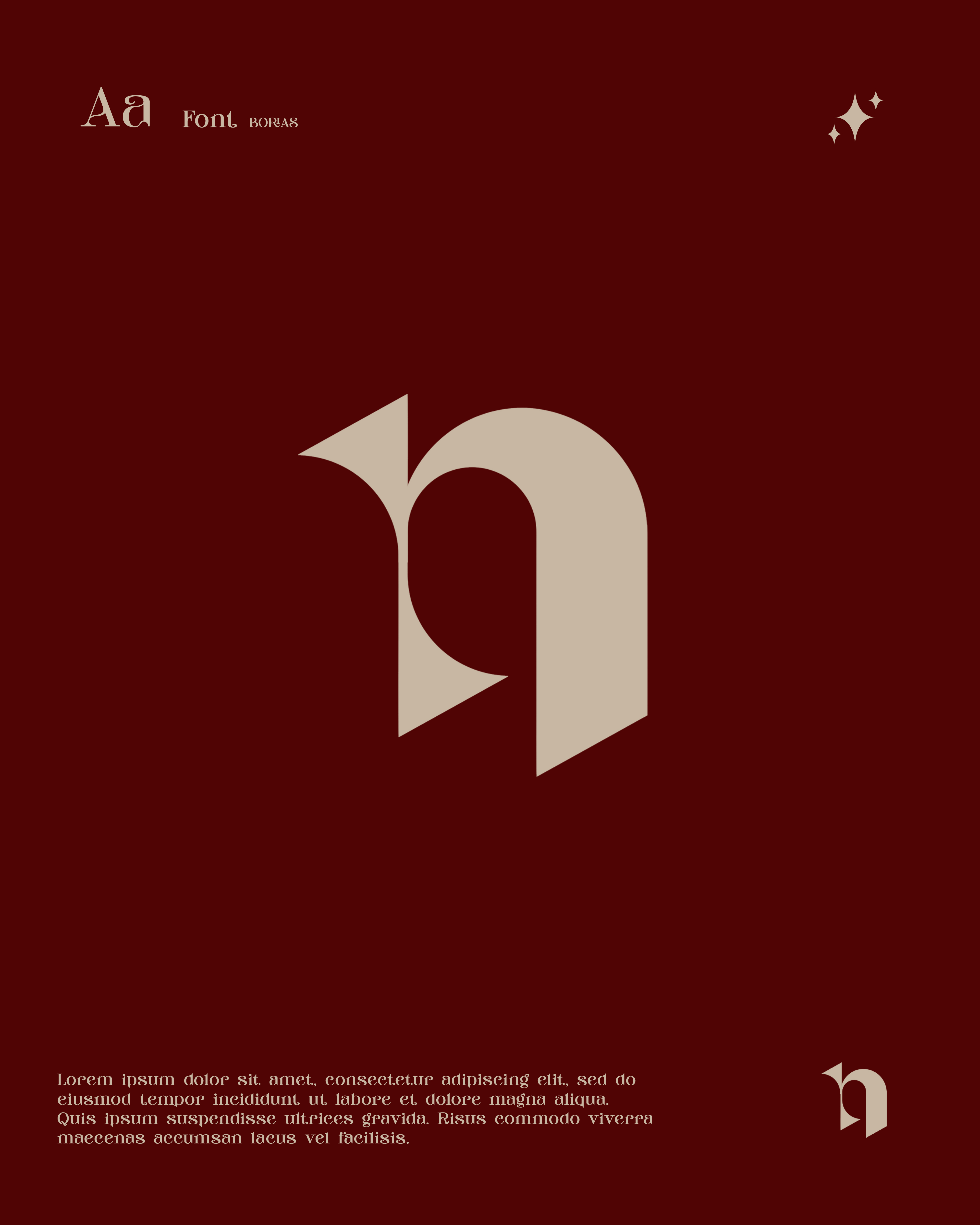
Visual and typograpy hierarchy
Visual hierarchy is the principle of arranging elements to show their order of importance. Designers structure visual characteristics—e.g., menu icons—so users can understand information easily. By laying out elements logically and strategically, designers influence users’ perceptions and guide them to desired actions. Users notice larger elements more easily can convert.

- regular This is text message
- Medium Medium typography
- SemiBold Just Amazing
- Blod Awesome