Digital Menu
Design
- Category UI/UX Design
- Client Revaal Menu
- Start Date 15 July 2024
- Handover 20 September 2024
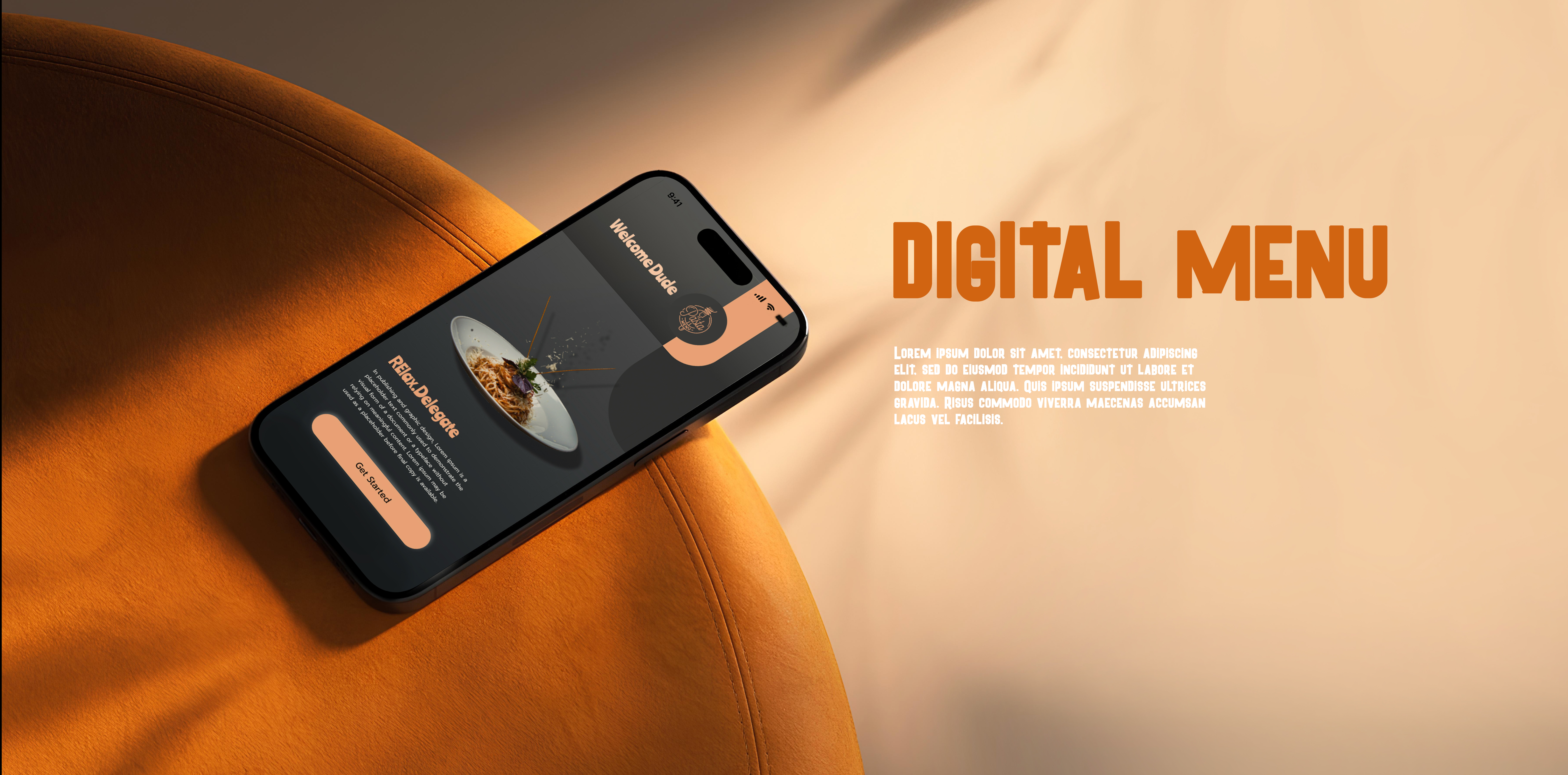
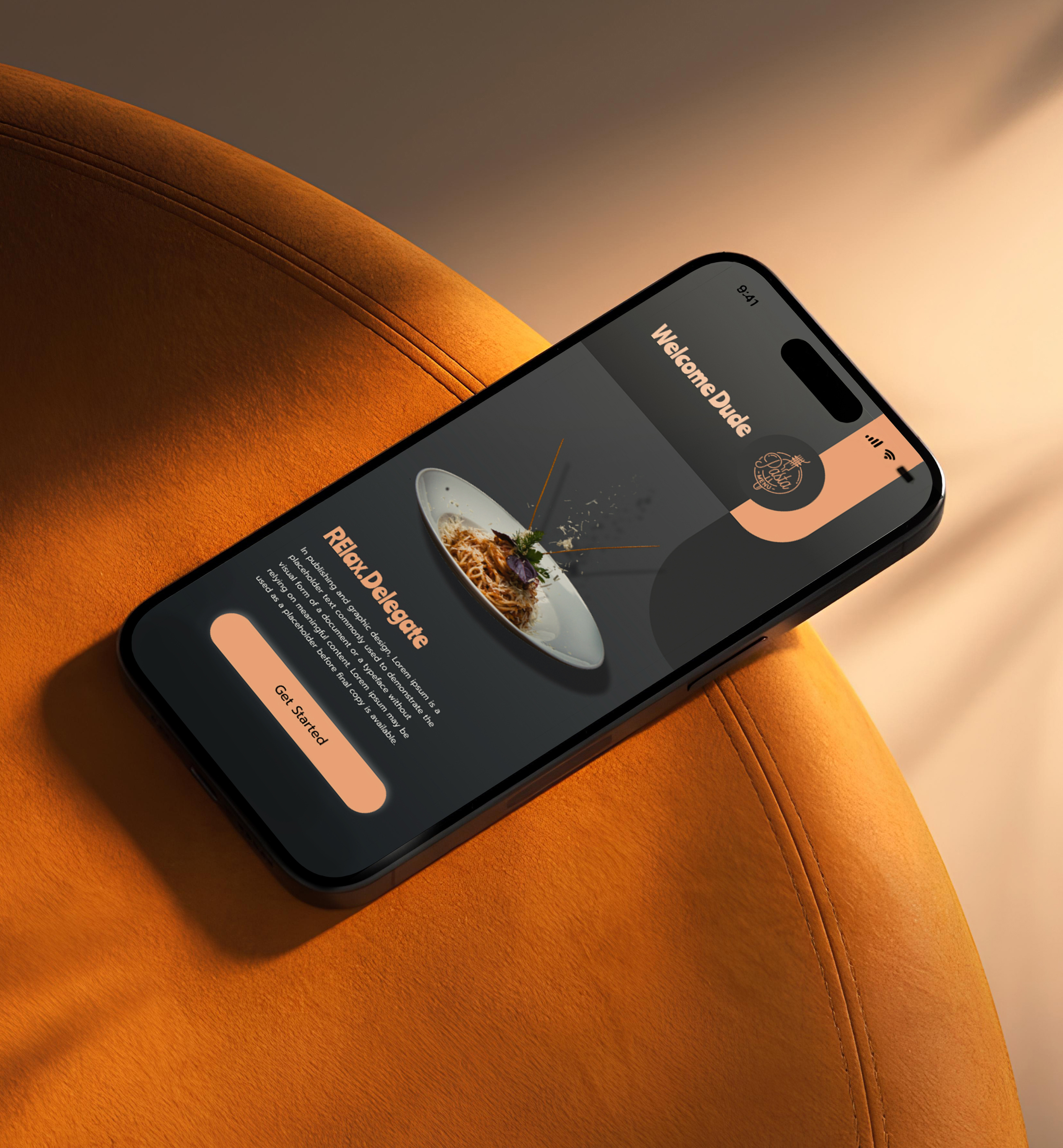
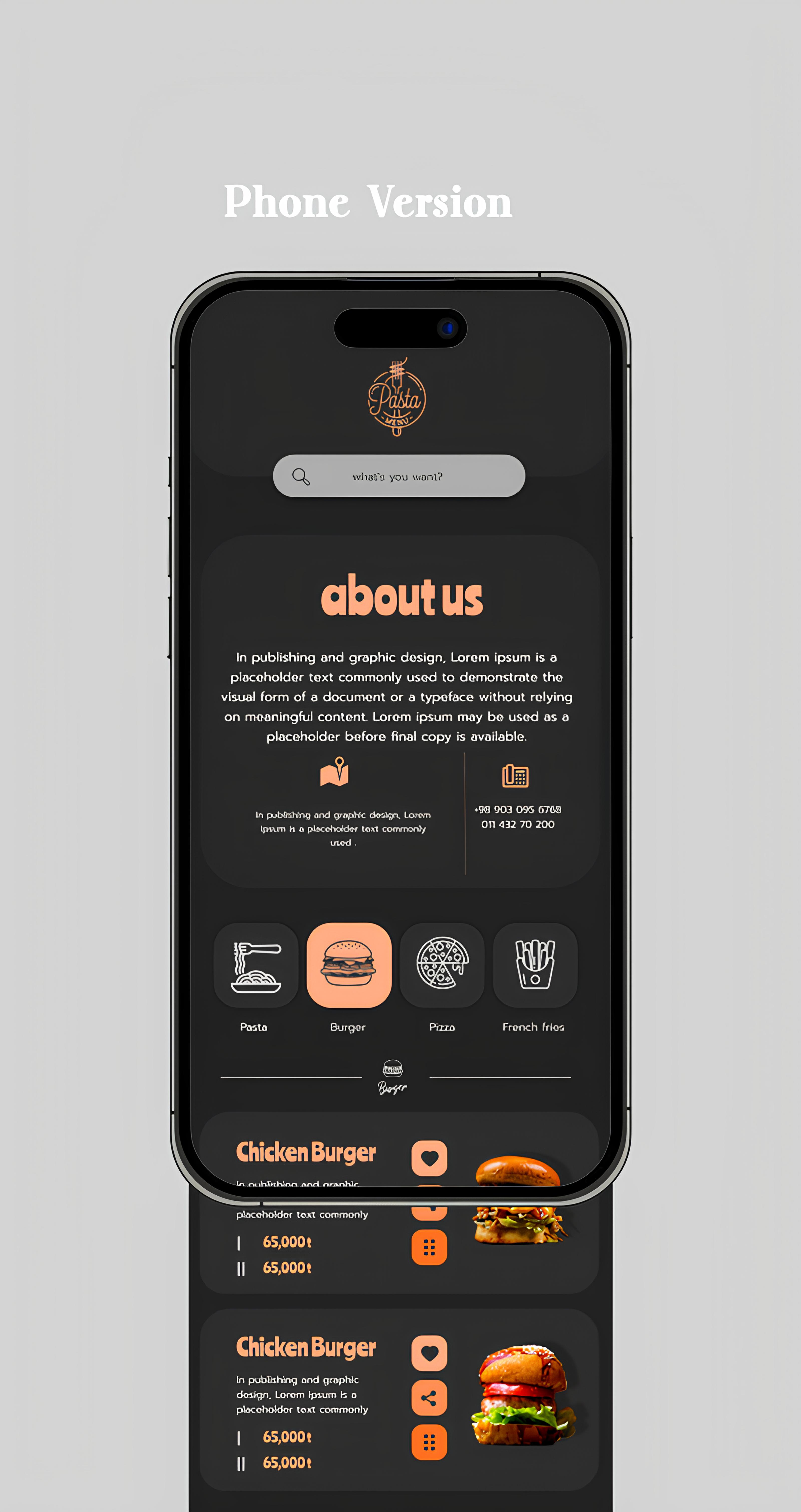
User-centered menu interface design
We designed the Revaal Menu interface in Figma with a focus on creating an exceptional user experience for restaurant customers. The design process began with extensive research into how people browse menus and make dining decisions. We created a clean, modern interface that puts food photography front and center, making each dish look as appetizing as possible. The navigation system was carefully crafted to allow users to effortlessly browse through different categories like appetizers, main courses, desserts, and beverages. We incorporated smart filtering options that let customers sort by dietary preferences, price range, or popularity. The design also includes interactive elements like expandable dish descriptions, ingredient lists, and customer ratings to help diners make informed choices. Every screen was optimized for both tablet displays commonly used in restaurants and mobile devices for on-the-go browsing.
- + User Research & Analysis
- + Interface Design in Figma
- + Category Navigation System
- + Interactive Prototyping
- + Mobile & Tablet Optimization
- + Visual Design System
Design system and components
To ensure consistency and scalability, we developed a comprehensive design system in Figma for the Revaal Menu project. This system includes reusable components for menu cards, category headers, buttons, icons, and interactive elements. We established a clear typography hierarchy using carefully selected fonts that are both elegant and highly readable. The color palette was designed to work harmoniously with food photography while maintaining excellent contrast for accessibility. We created multiple component variants to handle different states like hover, active, and disabled, ensuring smooth interactions throughout the user journey. The design system also includes spacing guidelines, grid layouts, and responsive breakpoints to maintain visual consistency across all screen sizes. By laying out elements logically and strategically, designers influence users’ perceptions and guide them to desired actions. Users notice larger elements more easily can convert.

- regular Explore menu items
- Medium View dish details
- SemiBold Check ratings
- Blod Place your order