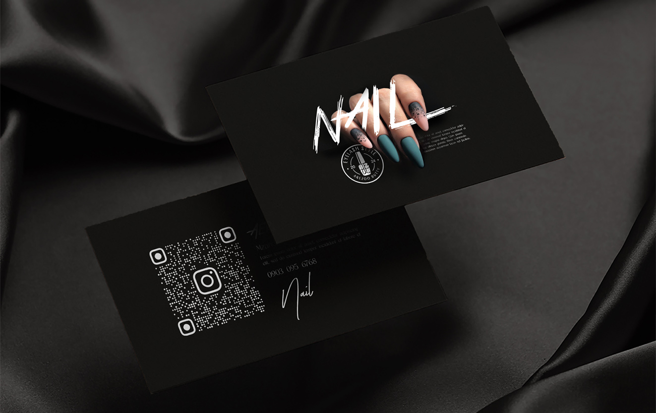
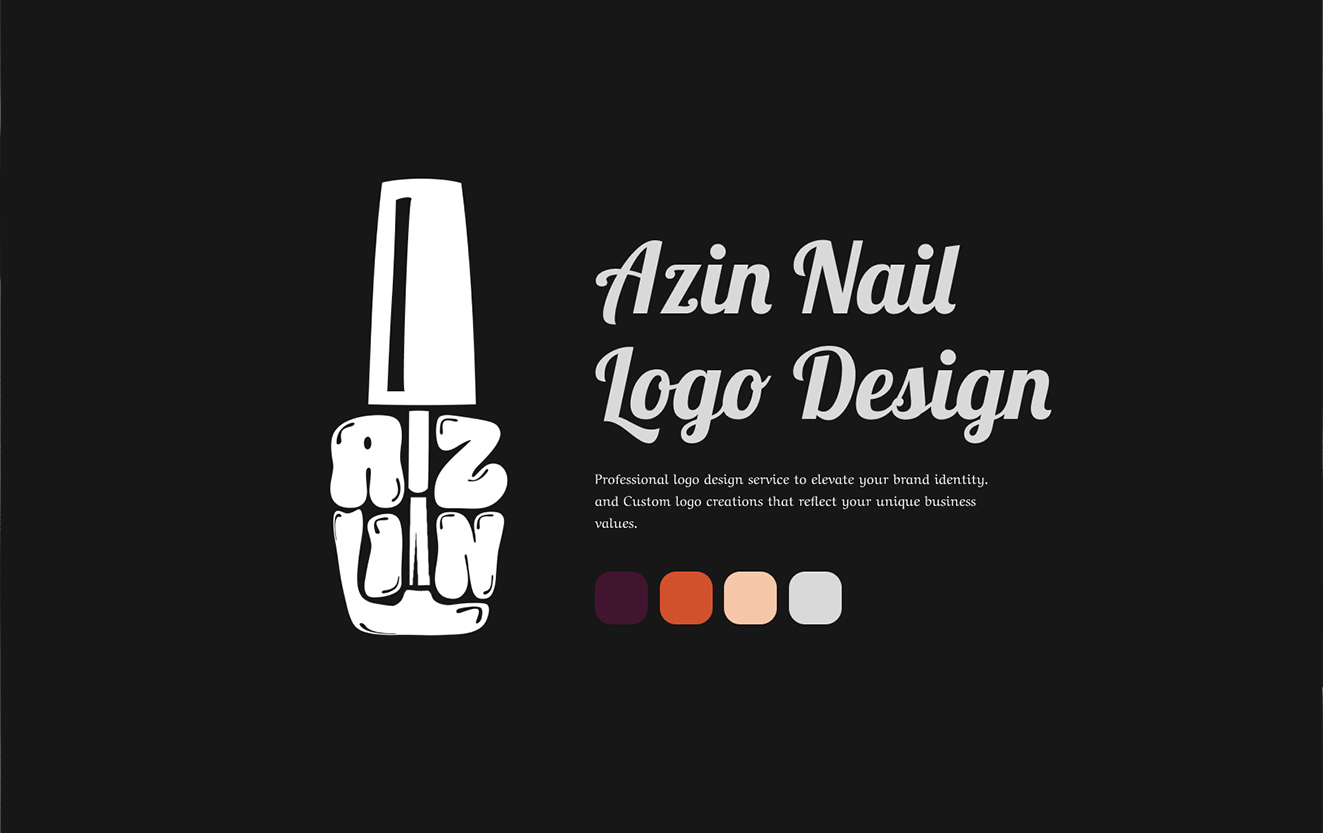
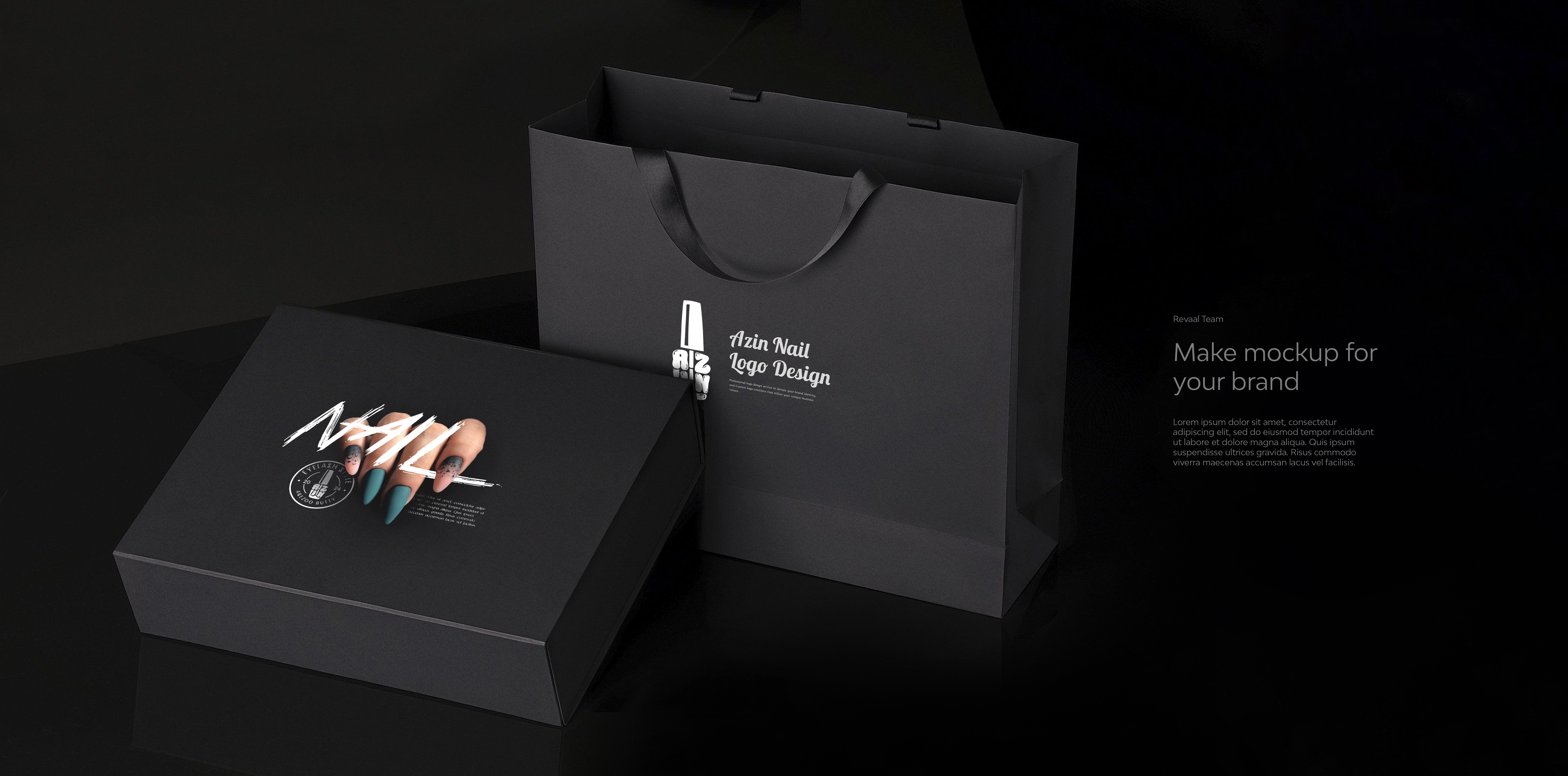
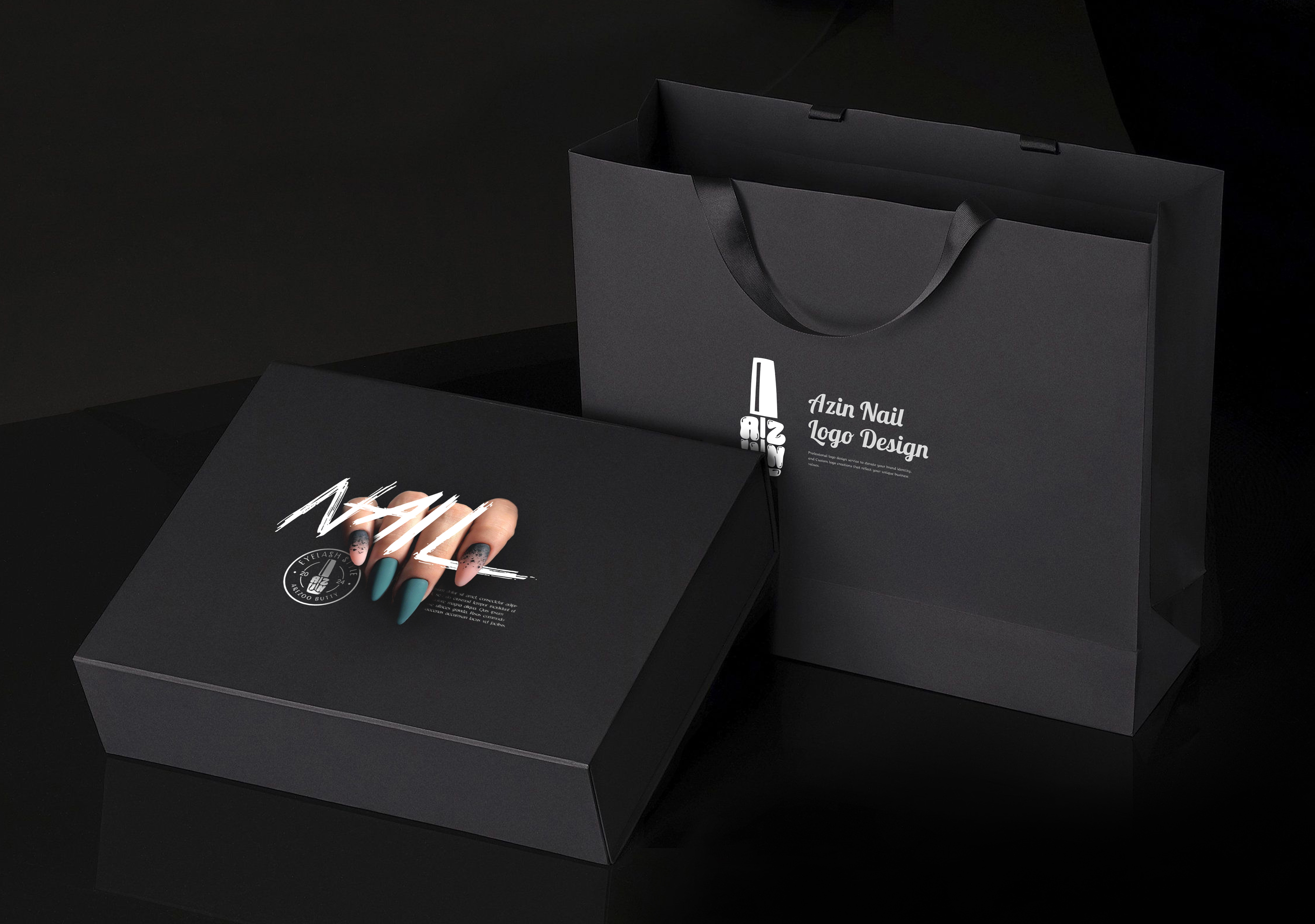
Azin Nail Care
Packaging
- Category Graphic Design - Package Design
- Client Mrs. Azin
- Start Date 20 February 2025
- Handover 25 April 2025
Nail care packaging that shines
We created elegant packaging for Azin Nail Care products, owned by Mrs. Azin, that positions the brand as a premium beauty solution in the competitive nail care market. The packaging design features sleek rectangular boxes with a glossy UV coating that creates a mirror-like finish, perfectly reflecting the polished aesthetic of nail care. We developed a color-coded system where different product lines use distinct pastel shades while maintaining consistent brand identity through typography and layout. Each box includes a transparent window that showcases the product inside, allowing customers to see the quality before purchase. We incorporated holographic foil accents on the logo and key product information that catch light beautifully and create visual interest on retail shelves. The packaging includes detailed product information in both Persian and English, along with usage instructions and ingredient lists that build customer trust. We designed the boxes to be stackable and space-efficient for retail display while maintaining their premium appearance.
- + Glossy UV Coating
- + Color-Coded Product Lines
- + Transparent Product Window
- + Holographic Foil Accents
- + Bilingual Product Information
- + Stackable Retail Design
Visual and typograpy hierarchy
Visual hierarchy is the principle of arranging elements to show their order of importance. Designers structure visual characteristics—e.g., menu icons—so users can understand information easily. By laying out elements logically and strategically, designers influence users’ perceptions and guide them to desired actions. Users notice larger elements more easily can convert.

- regular This is text message
- Medium Medium typography
- SemiBold Just Amazing
- Blod Awesome