Revnix Company
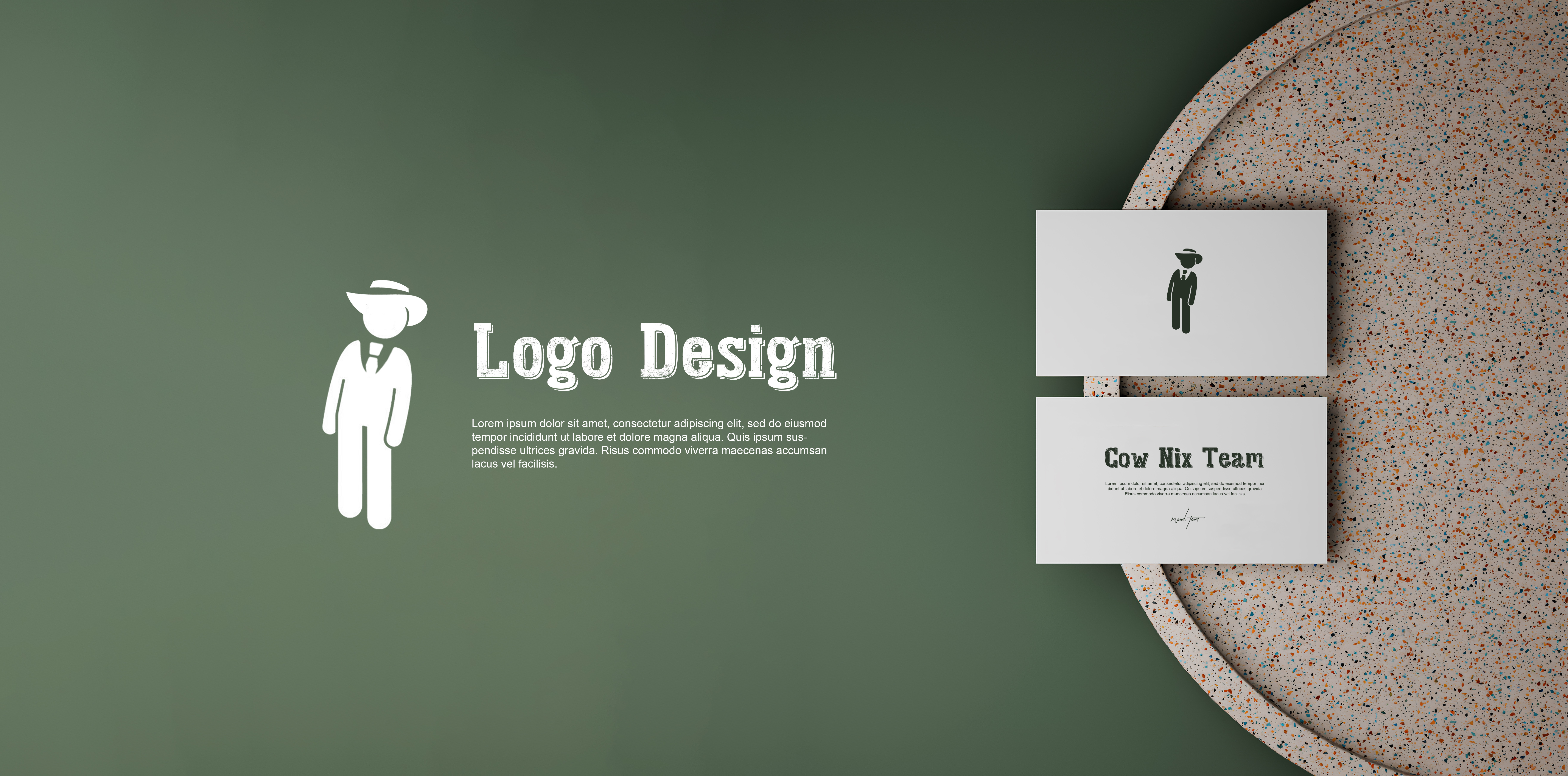
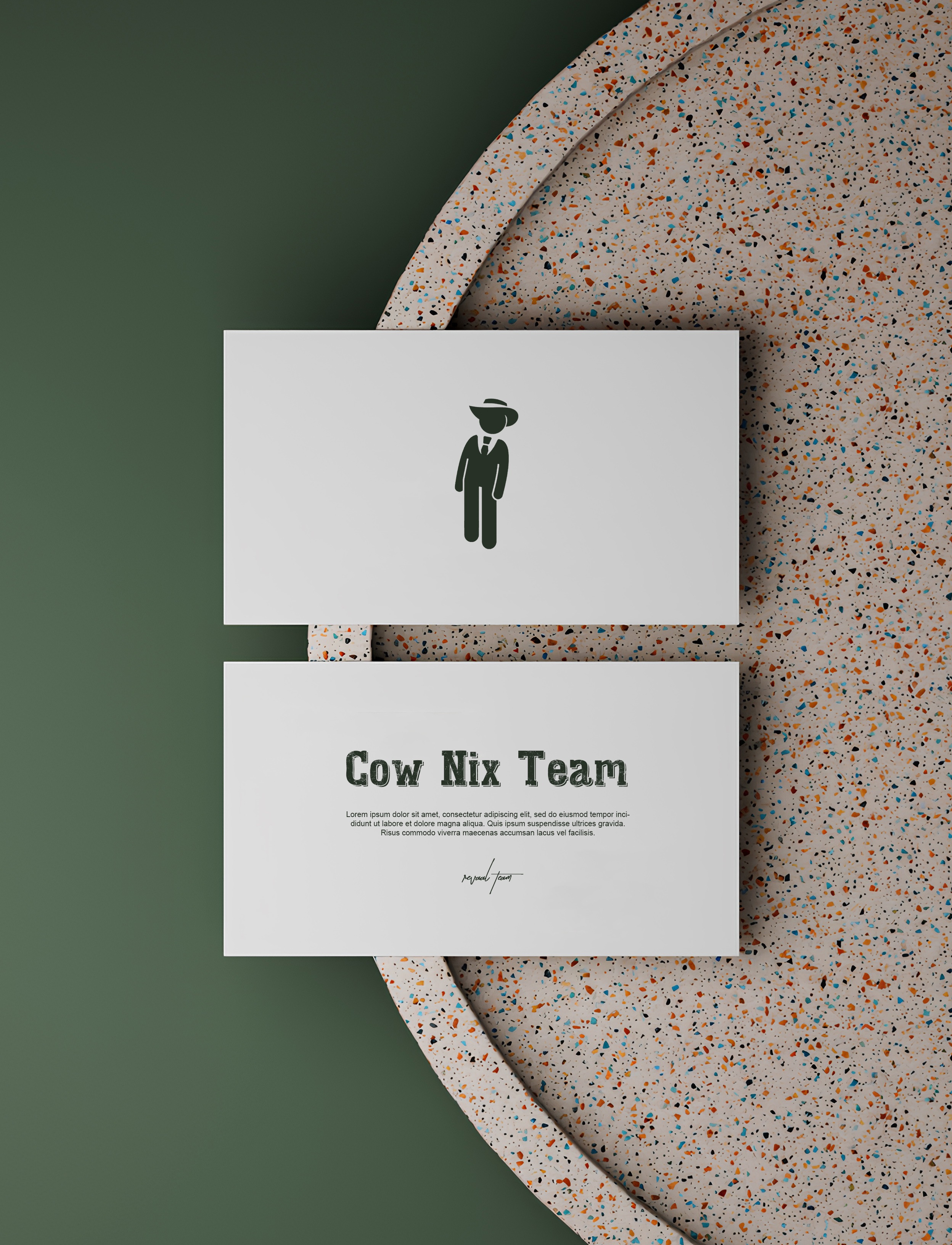
Logo & Package
- Category Graphic Design - Corporate Branding
- Client Revnix Company
- Start Date 20 July 2025
- Handover 25 September 2025
Corporate identity that stands out
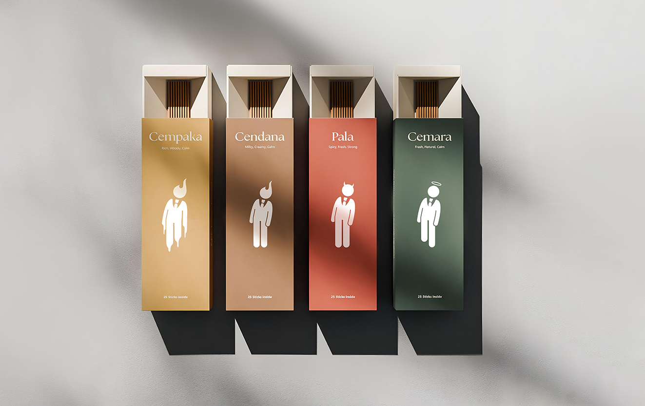
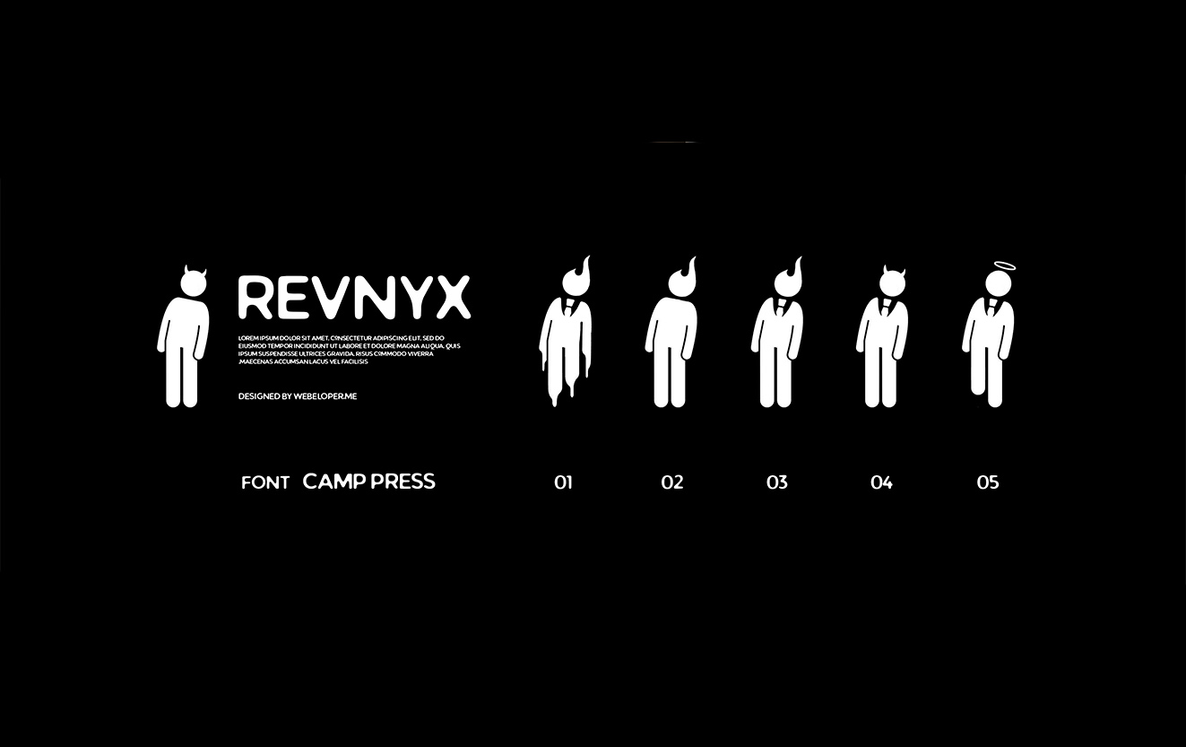
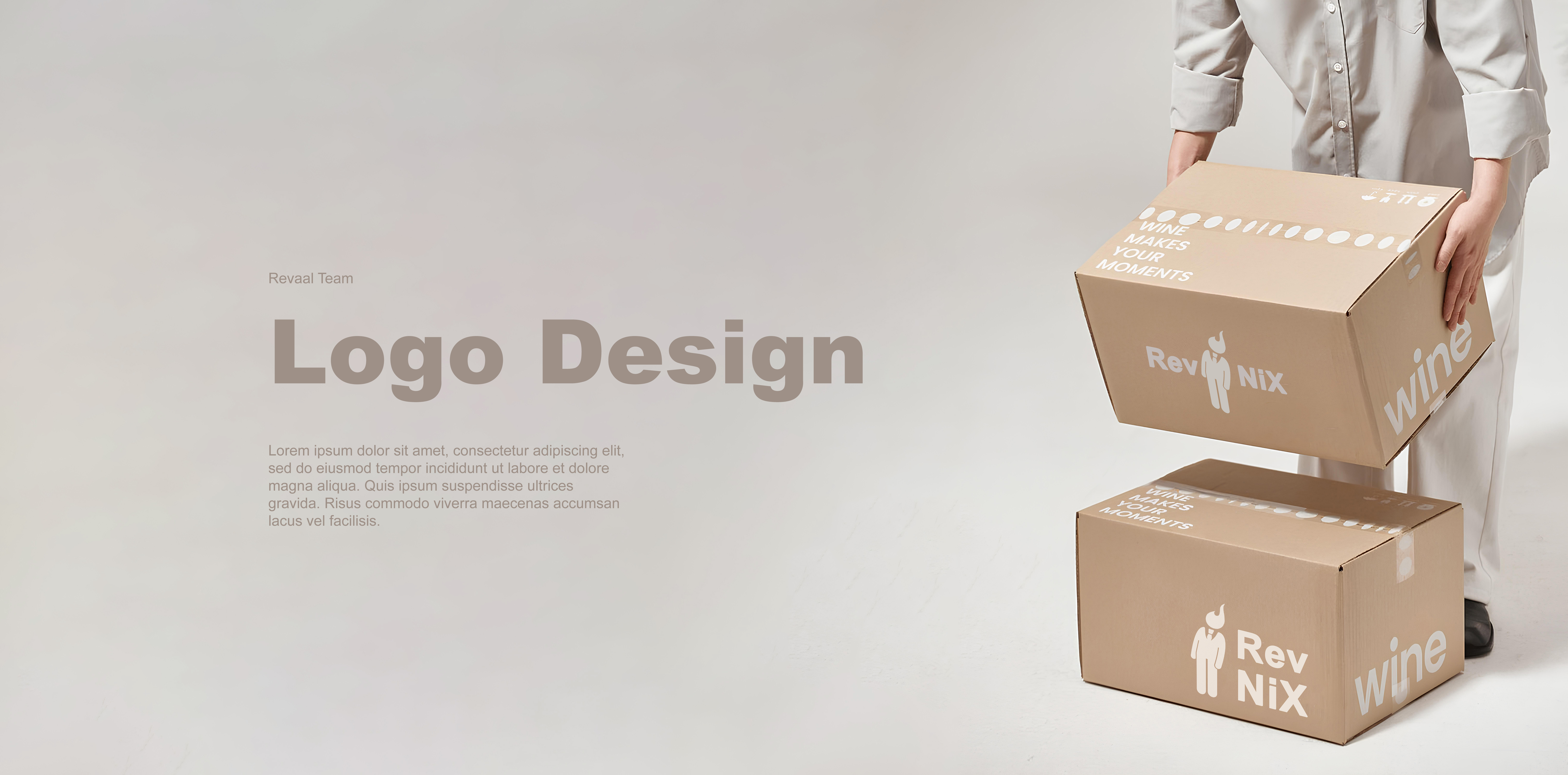
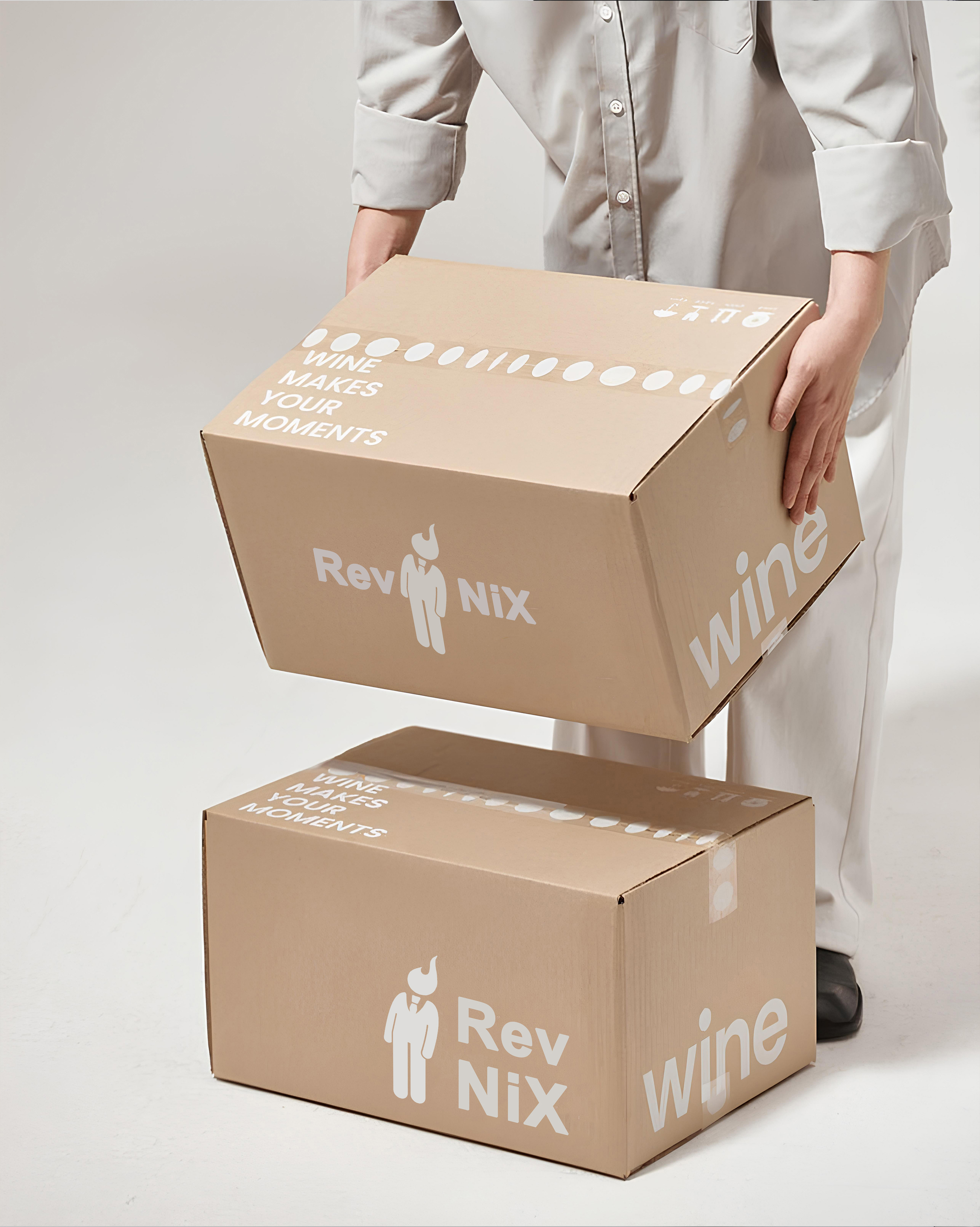
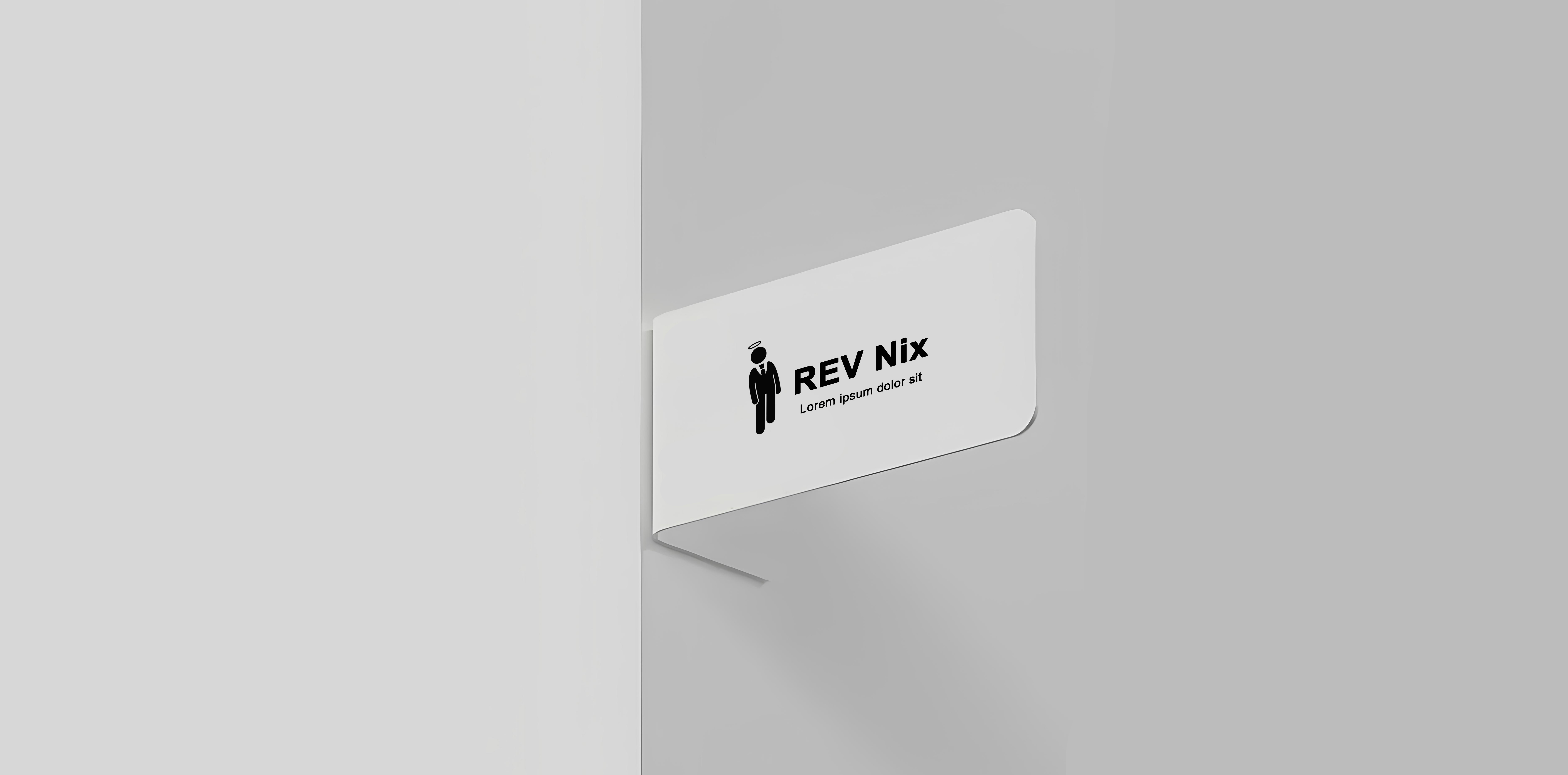
We created a comprehensive corporate brand identity for Revnix Company that establishes strong market presence and professional credibility. The logo design features a modern geometric symbol combining the letters 'R' and 'X' in a dynamic arrangement that suggests innovation and forward movement. We developed packaging for their product line using premium materials with a sophisticated color palette of deep navy blue, silver, and white that conveys trust and technological expertise. The packaging system includes various sizes for different product categories, all maintaining consistent brand aesthetics through typography, color usage, and layout principles. We designed a complete stationery set including letterheads, envelopes, and folders using high-quality paper with subtle texture and spot UV coating on the logo. Each package features clean lines and minimalist design that allows the product to be the hero while maintaining strong brand presence. We incorporated security features like holographic seals and unique serial numbers that prevent counterfeiting and build customer confidence in product authenticity.
- + Modern Geometric Logo
- + Premium Packaging Materials
- + Complete Stationery Set
- + Holographic Security Seals
- + Multi-Size Package System
- + Spot UV Coating
- + Serial Number Tracking
Visual and typograpy hierarchy
Visual hierarchy is the principle of arranging elements to show their order of importance. Designers structure visual characteristics—e.g., menu icons—so users can understand information easily. By laying out elements logically and strategically, designers influence users’ perceptions and guide them to desired actions. Users notice larger elements more easily can convert.

- regular This is text message
- Medium Medium typography
- SemiBold Just Amazing
- Blod Awesome