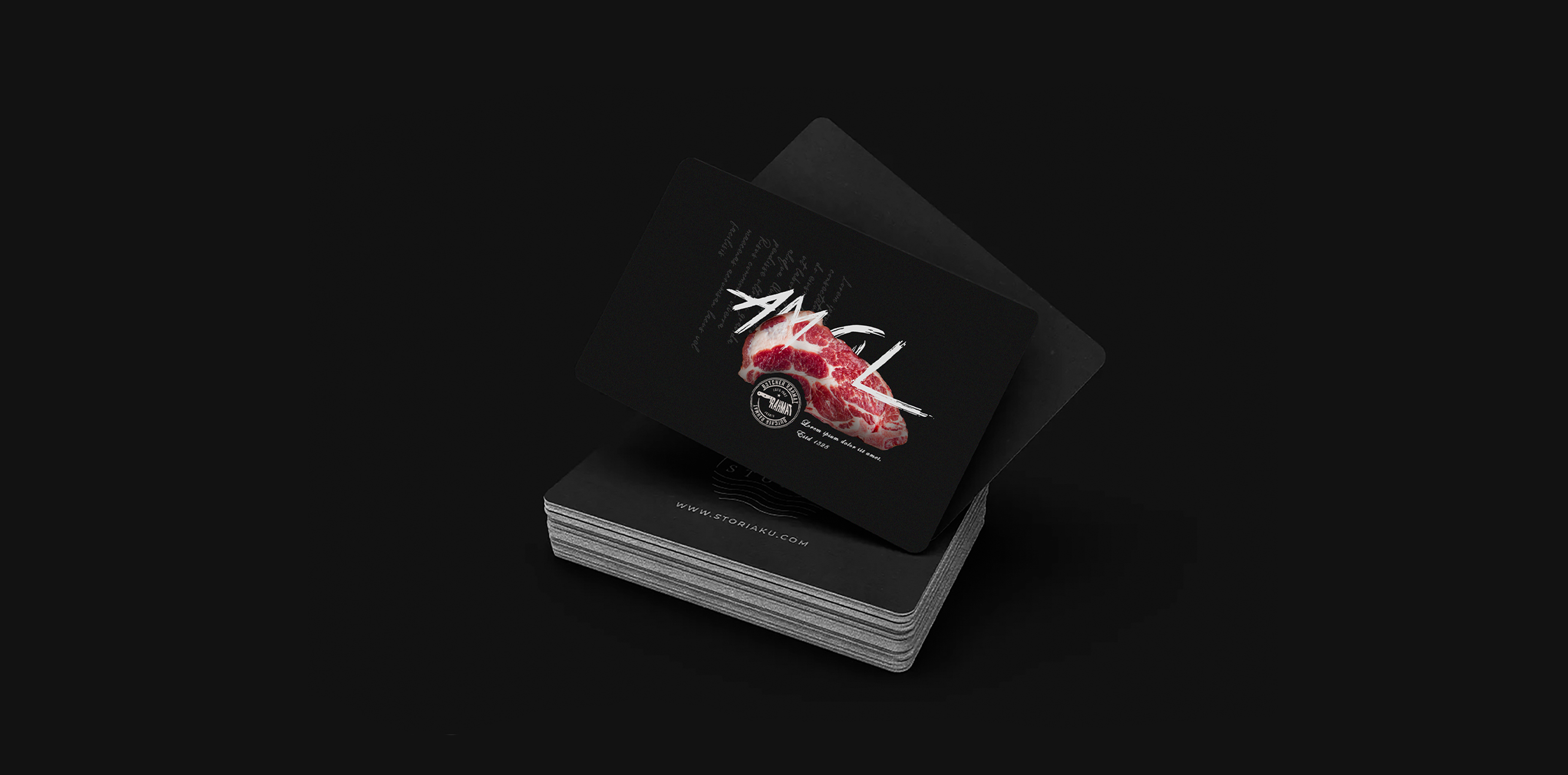
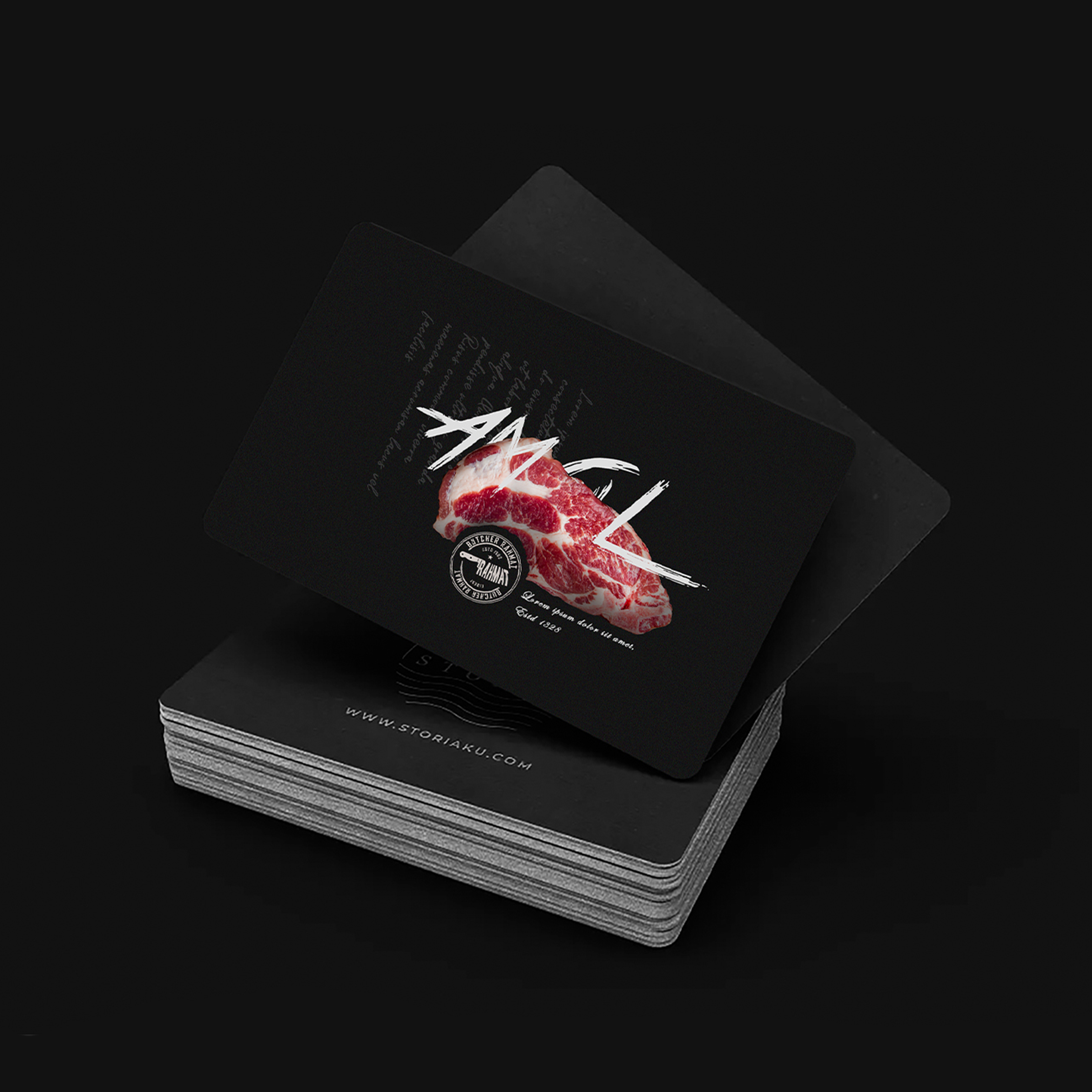
Rahmat Butchery
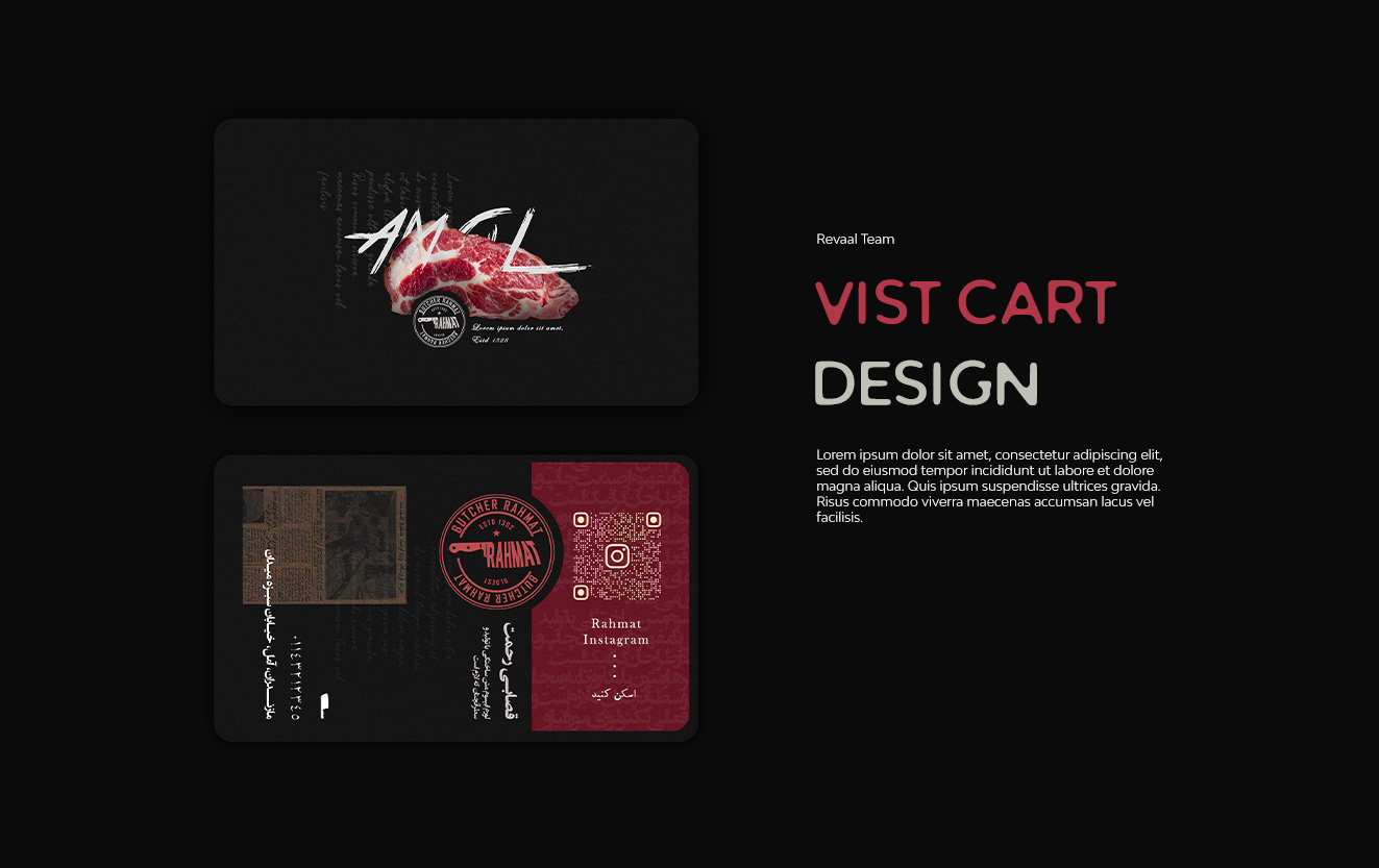
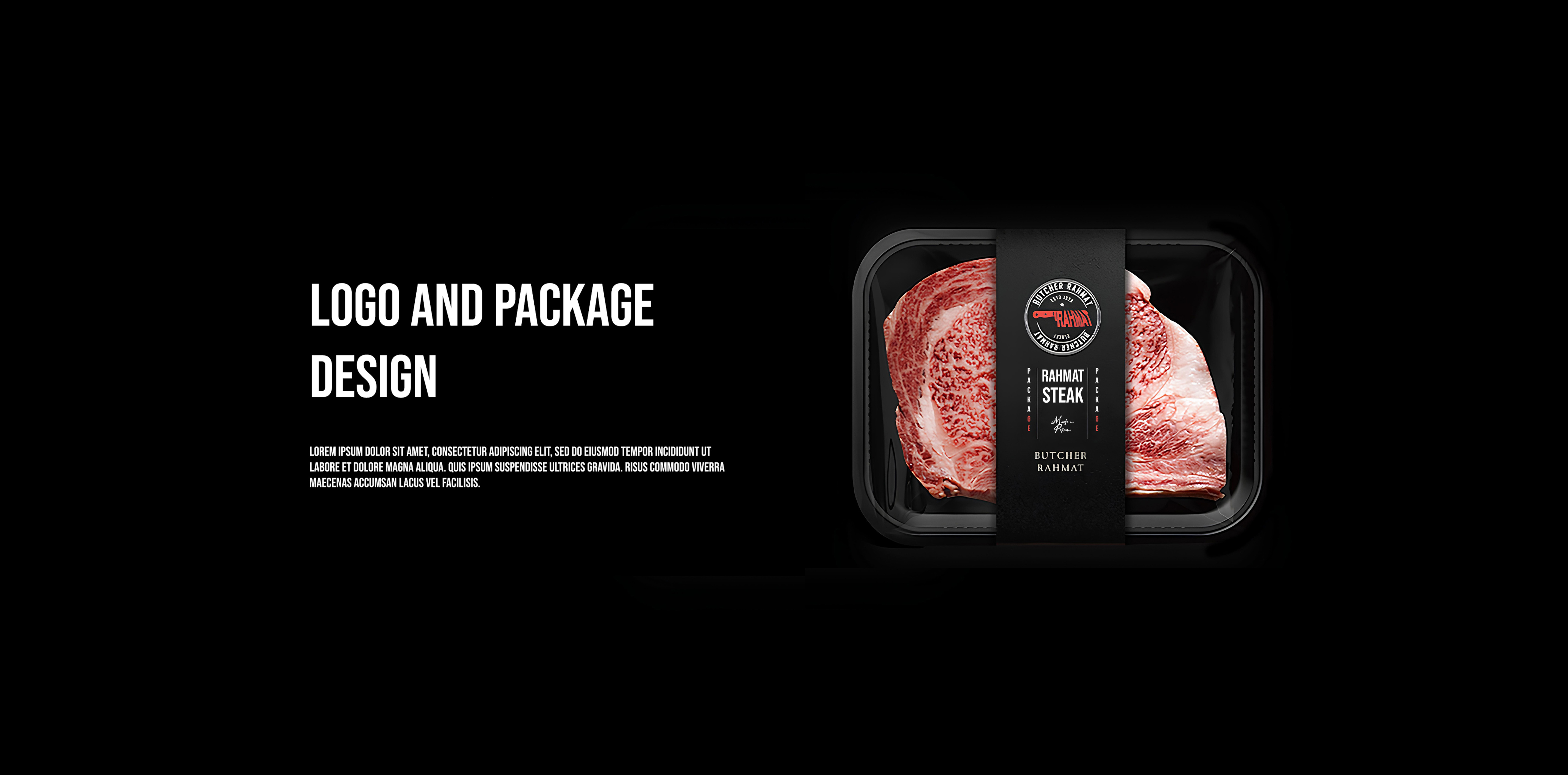
Logo & Package
- Category Graphic Design - Branding & Package
- Client Mr. Rahmat
- Start Date 20 June 2025
- Handover 25 August 2025
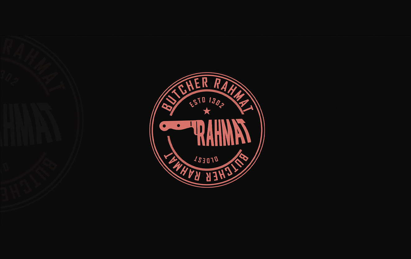
Butchery branding that builds trust
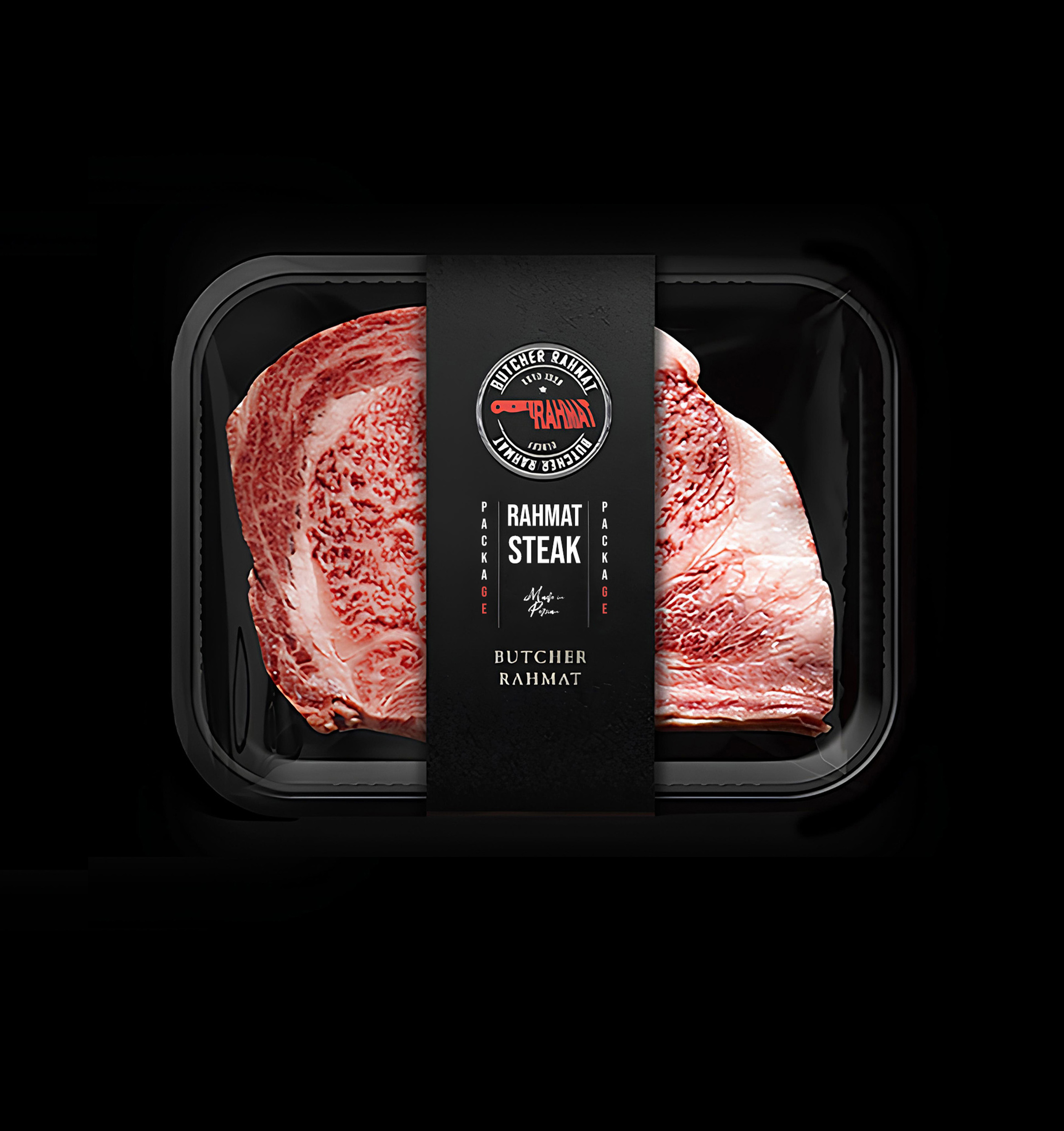
We developed a comprehensive brand identity for Rahmat Butchery, owned by Mr. Rahmat, that communicates quality, freshness, and traditional craftsmanship in the meat industry. The logo design features a classic butcher's cleaver combined with elegant typography that balances heritage with modern professionalism. We created packaging for various meat products using food-grade materials with moisture-resistant coatings that maintain product quality during storage and transport. The packaging design includes clear product windows that allow customers to inspect meat quality before purchase, building transparency and trust. We developed a color-coding system where different meat types use distinct colors - red for beef, pink for chicken, burgundy for lamb - making it easy for customers to identify products quickly. Each package includes detailed information about cut type, weight, storage instructions, and cooking recommendations that add value beyond just the product. We designed labels with halal certification prominently displayed, meeting religious requirements and customer expectations in the market.
- + Classic Logo Design
- + Food-Grade Packaging
- + Color-Coded Meat Types
- + Clear Product Windows
- + Halal Certification
- + Detailed Product Information
Visual and typograpy hierarchy
Visual hierarchy is the principle of arranging elements to show their order of importance. Designers structure visual characteristics—e.g., menu icons—so users can understand information easily. By laying out elements logically and strategically, designers influence users’ perceptions and guide them to desired actions. Users notice larger elements more easily can convert.

- regular This is text message
- Medium Medium typography
- SemiBold Just Amazing
- Blod Awesome