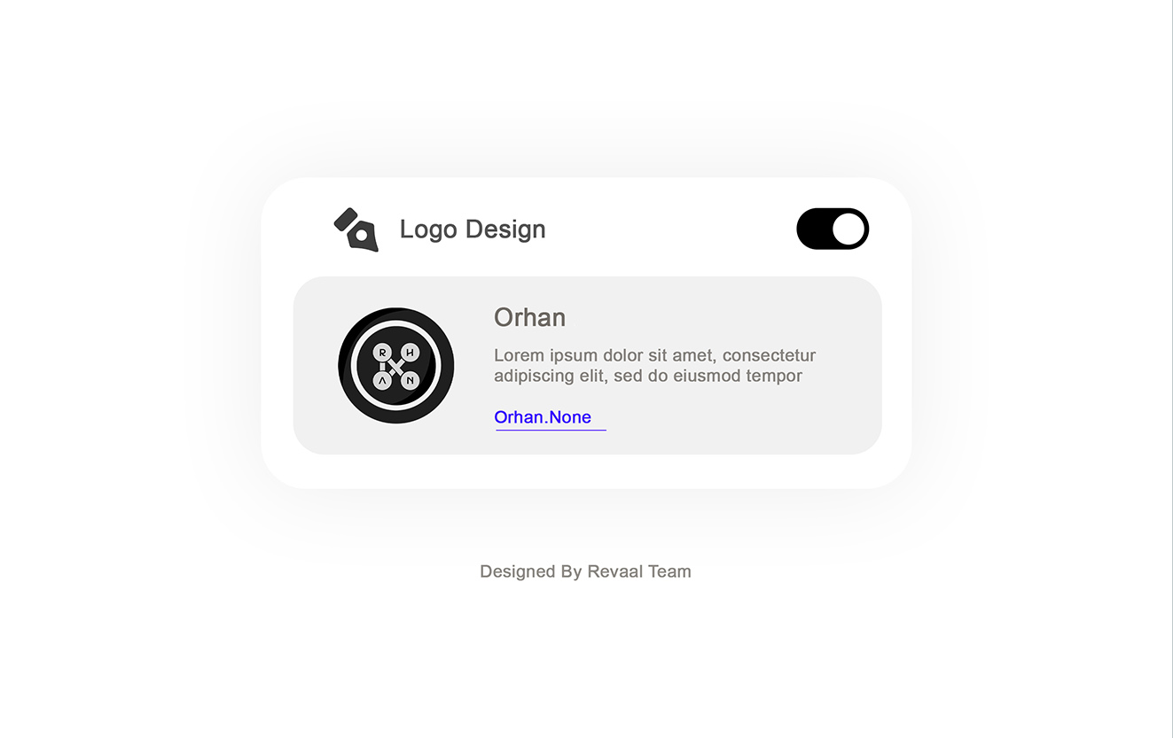
Orhan Salon
Card & Logo
- Category Graphic Design - Branding & Card
- Client Mr. Sobhan
- Start Date 20 March 2025
- Handover 25 May 2025
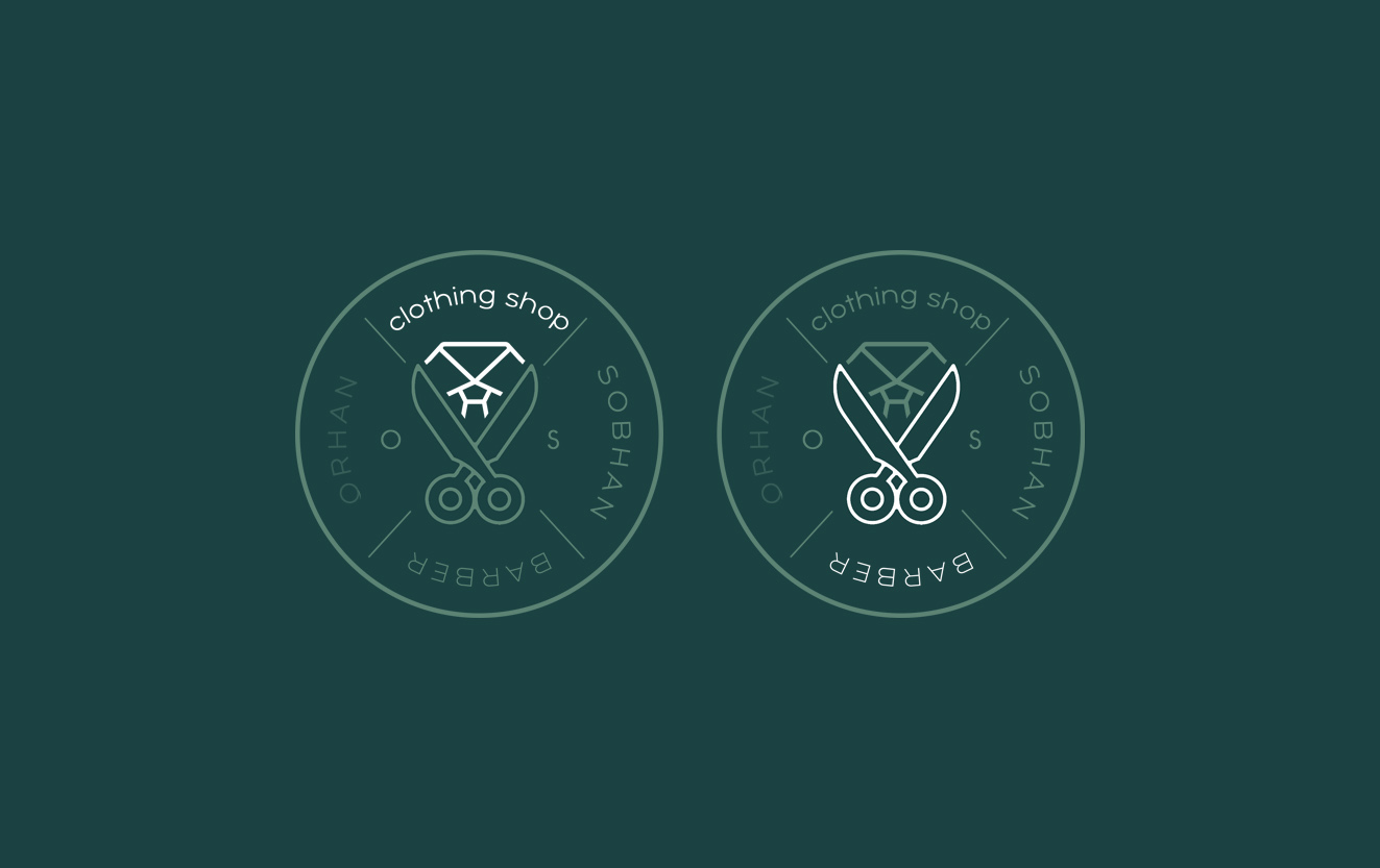
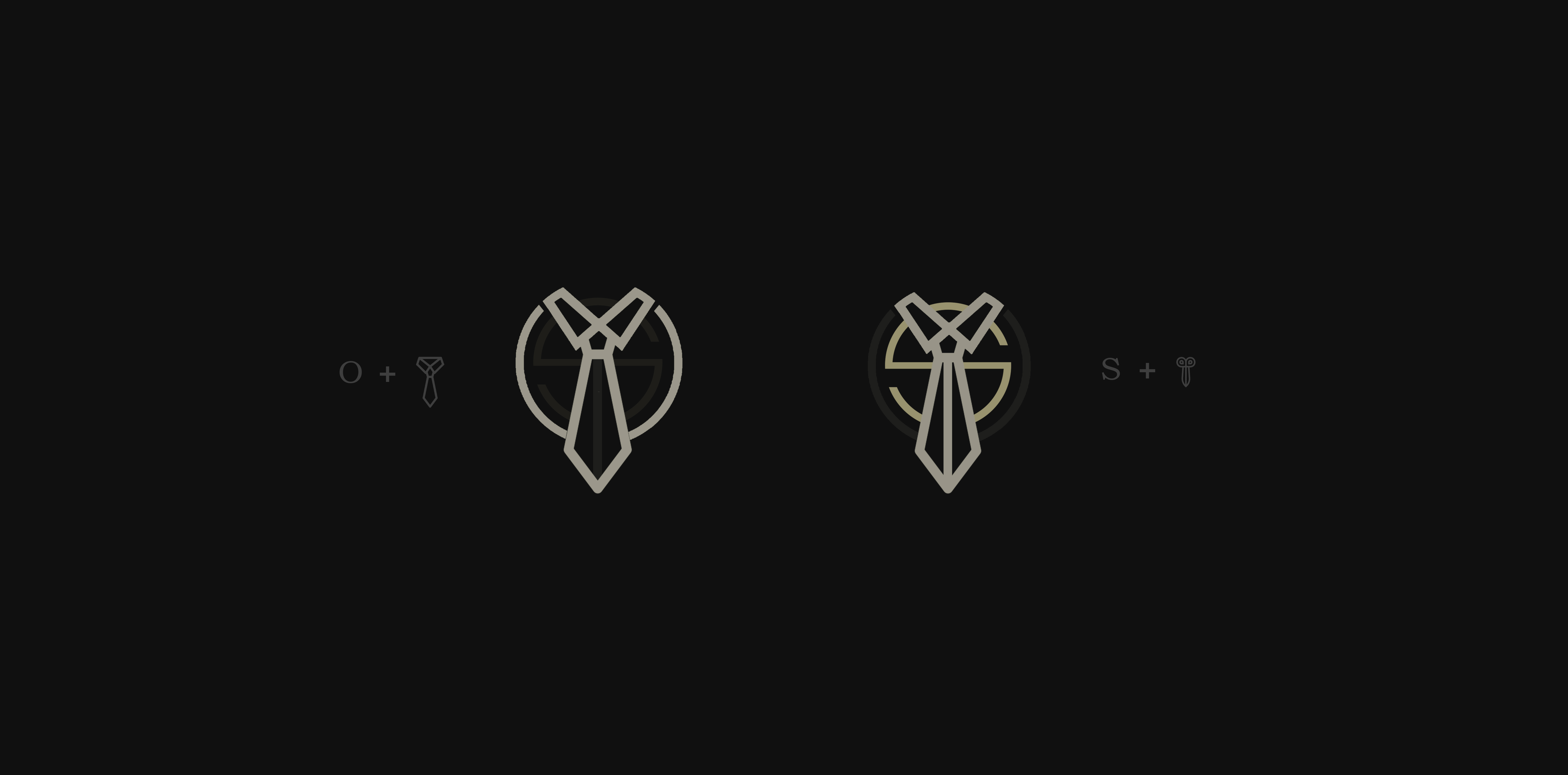
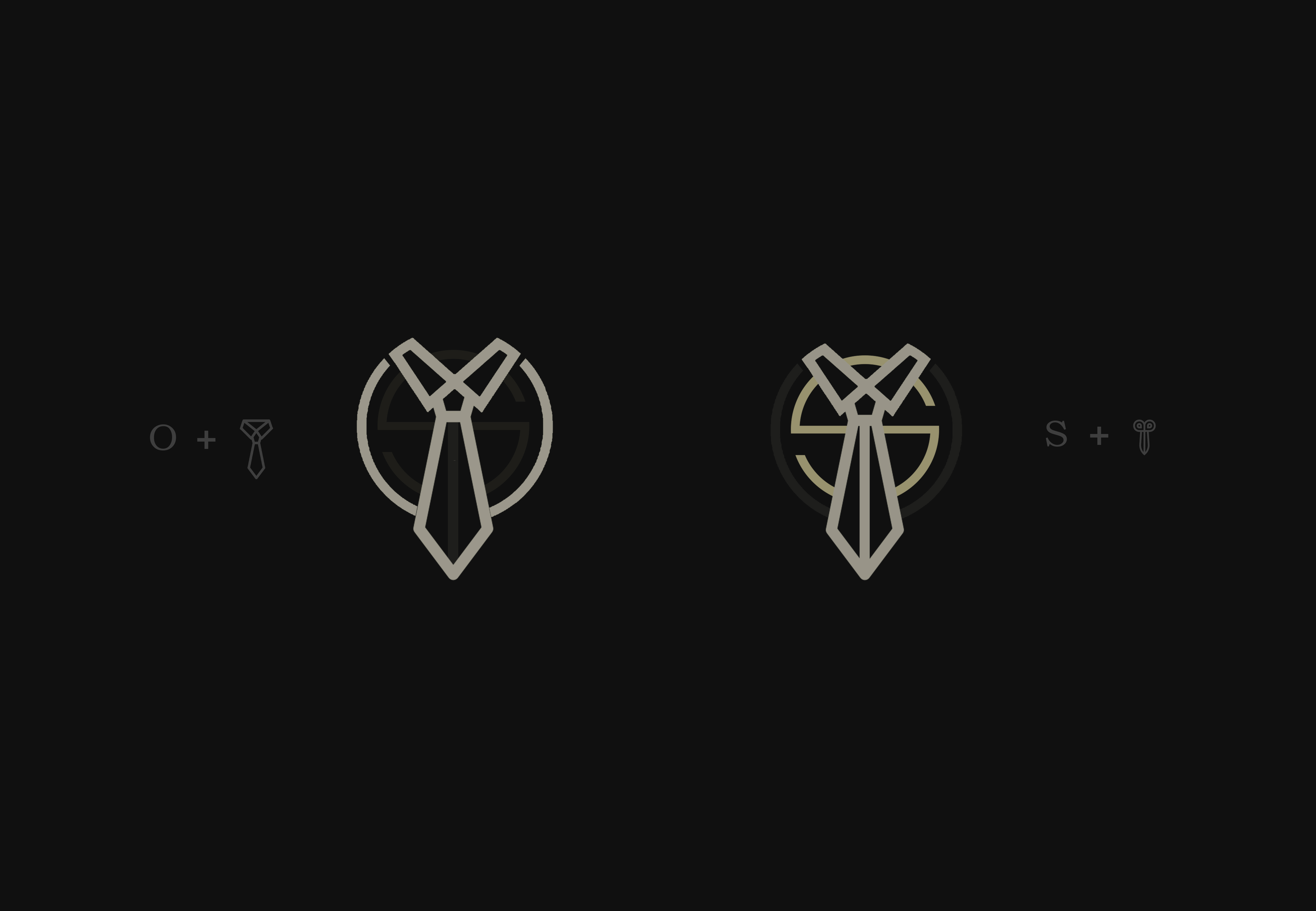
Salon branding that cuts through
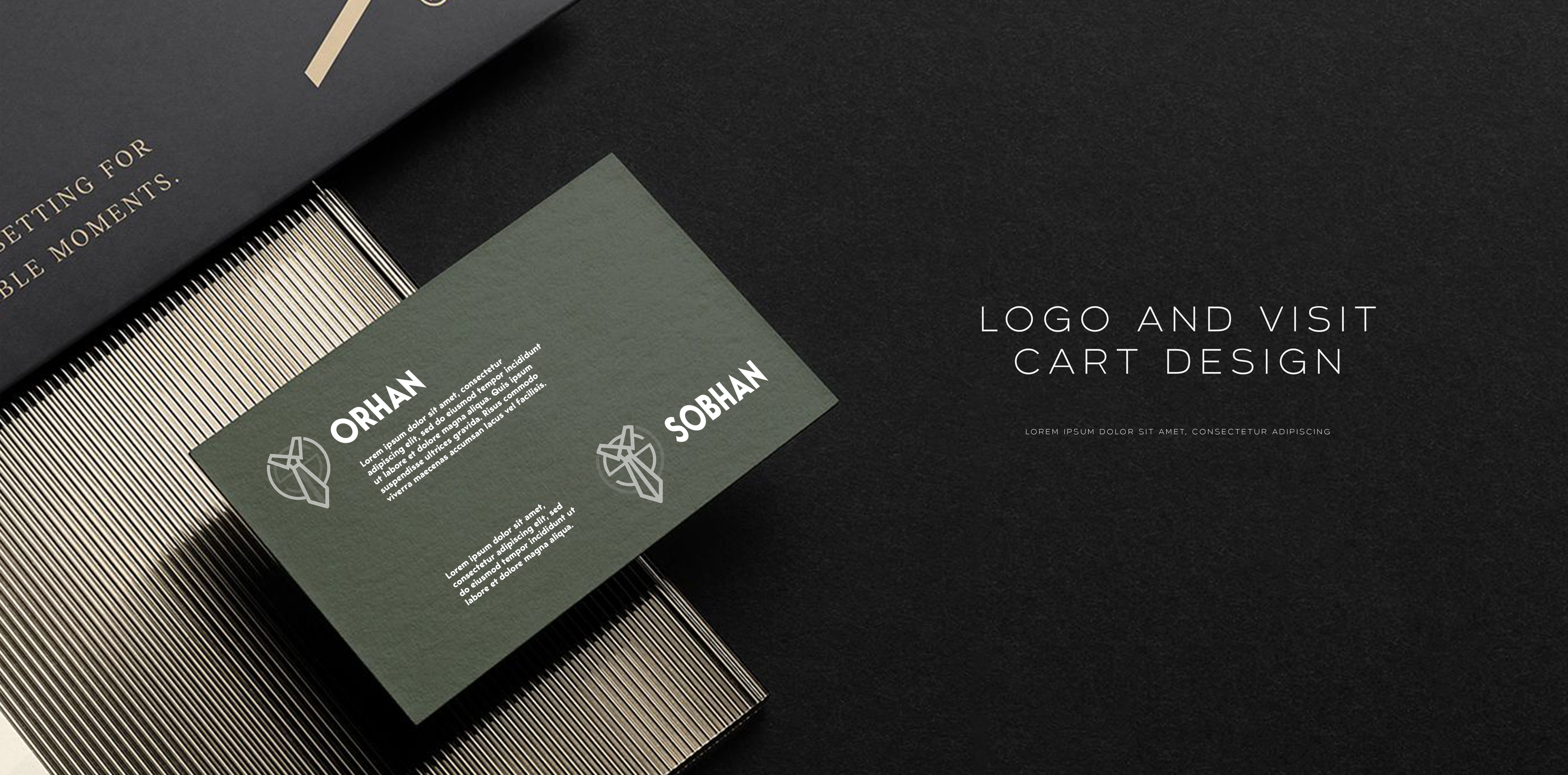
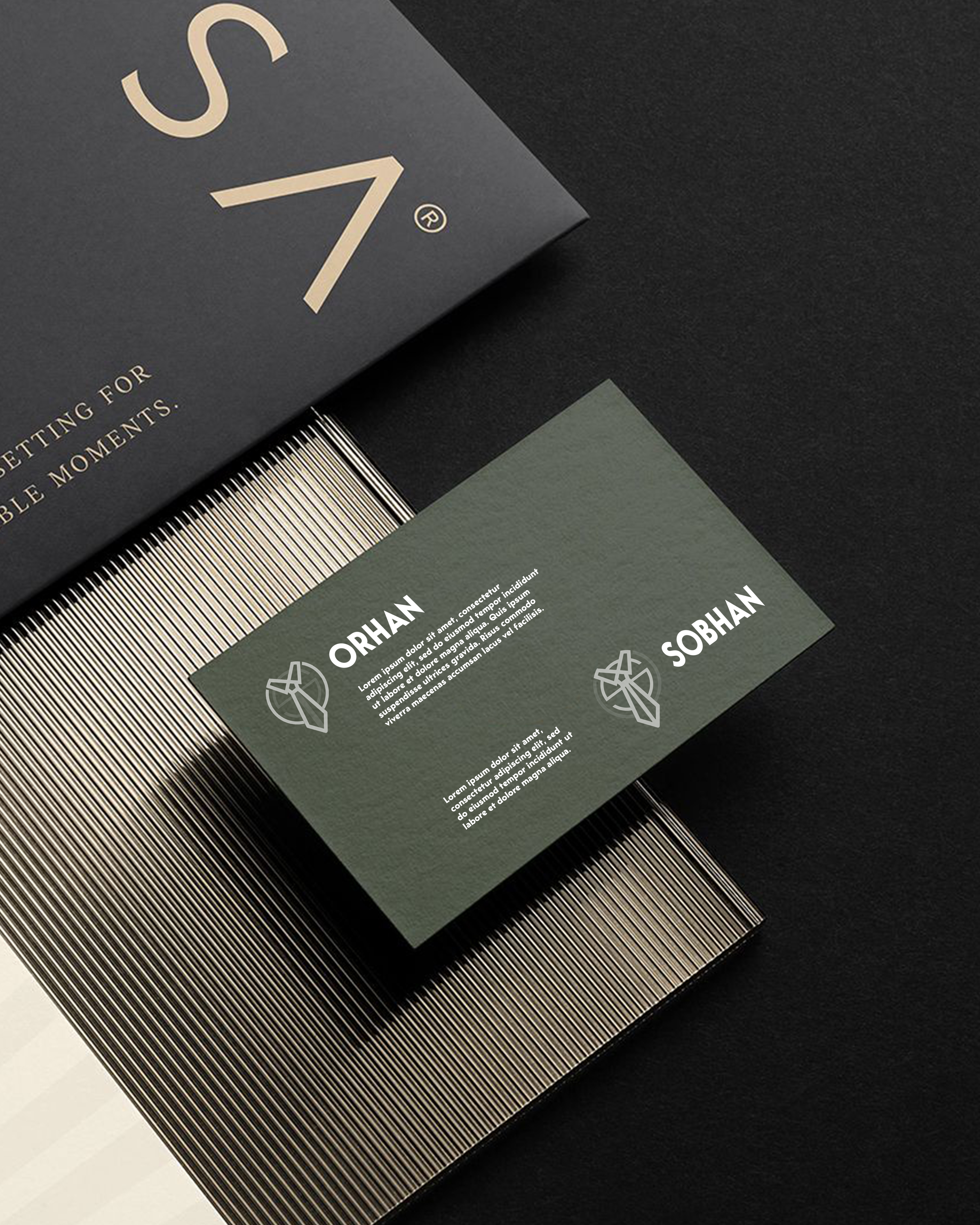
We developed a complete brand identity for Orhan Salon, owned by Mr. Sobhan, that positions the business as a premium men's grooming destination. The logo design features a sophisticated monogram combining the letters 'O' and 'S' with clean geometric lines that convey precision and professionalism. We created business cards using thick black matte cardstock with white foil stamping that creates a striking contrast and memorable tactile experience. The cards include a subtle texture pattern inspired by classic barber poles, adding visual interest without overwhelming the minimalist design. We incorporated a QR code that links to the salon's booking system and social media, making it easy for clients to schedule appointments. The color scheme uses deep charcoal, crisp white, and metallic silver accents that evoke masculinity and sophistication. Each business card features rounded corners and spot UV coating on the logo that adds a premium touch clients will remember.
- + Monogram Logo Design
- + Black Matte Cardstock
- + White Foil Stamping
- + QR Code Integration
- + Spot UV Coating
- + Rounded Corner Finish
Visual and typograpy hierarchy
Visual hierarchy is the principle of arranging elements to show their order of importance. Designers structure visual characteristics—e.g., menu icons—so users can understand information easily. By laying out elements logically and strategically, designers influence users’ perceptions and guide them to desired actions. Users notice larger elements more easily can convert.

- regular This is text message
- Medium Medium typography
- SemiBold Just Amazing
- Blod Awesome