Arezoo Beauty
Package & Logo
- Category Graphic Design - Branding & Package
- Client Mrs. Arezoo
- Start Date 20 May 2025
- Handover 25 July 2025
Beauty service branding with elegance
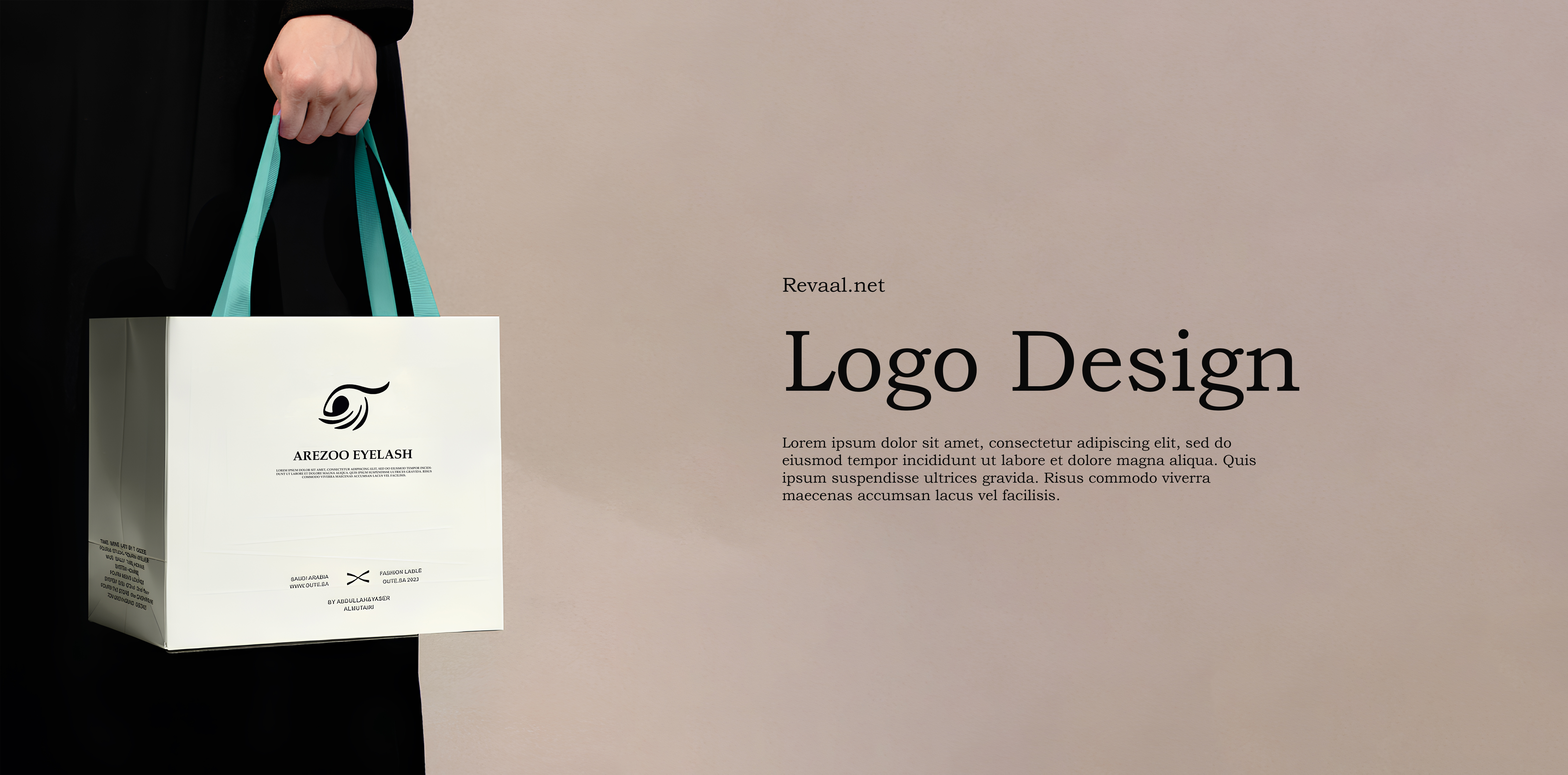
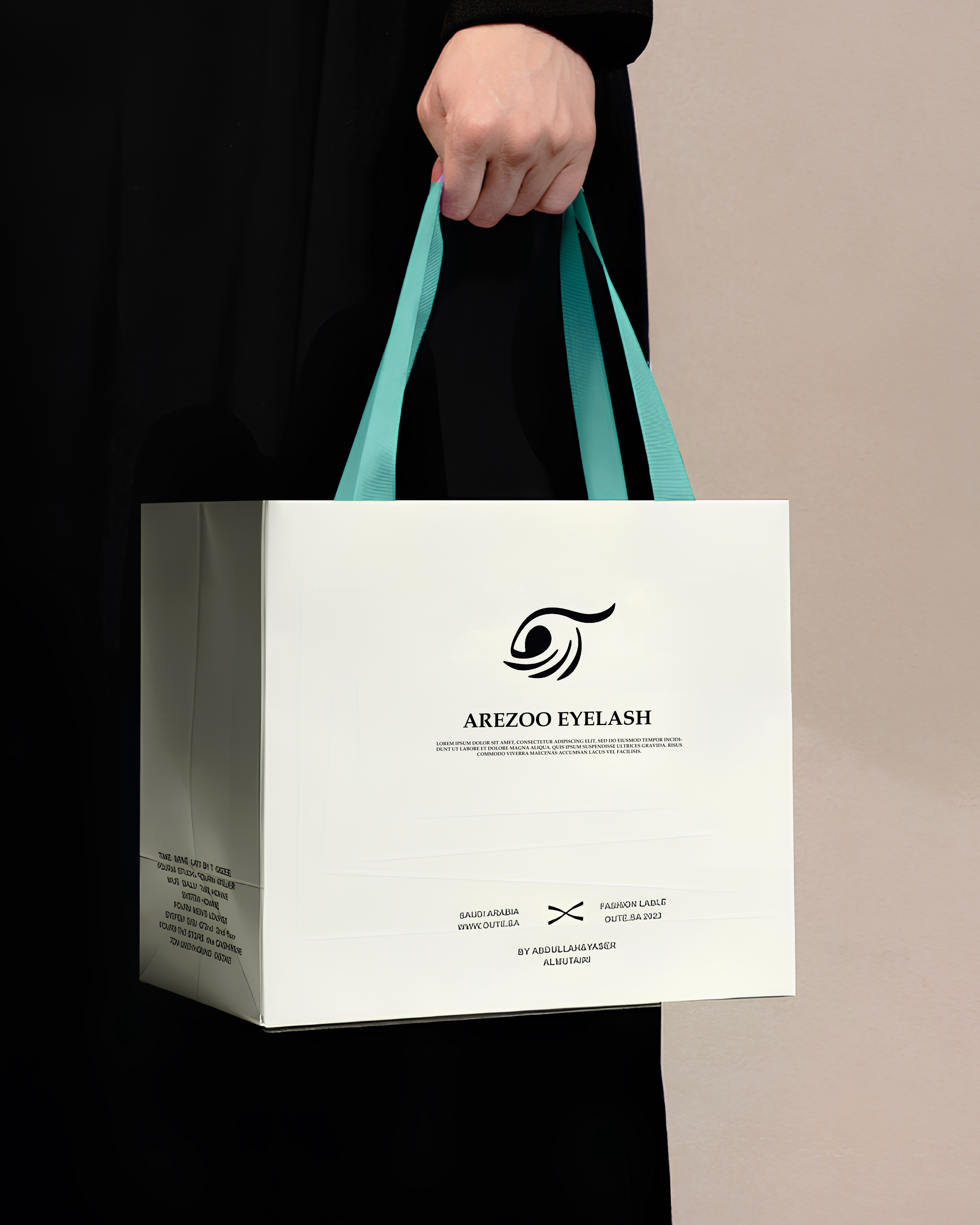
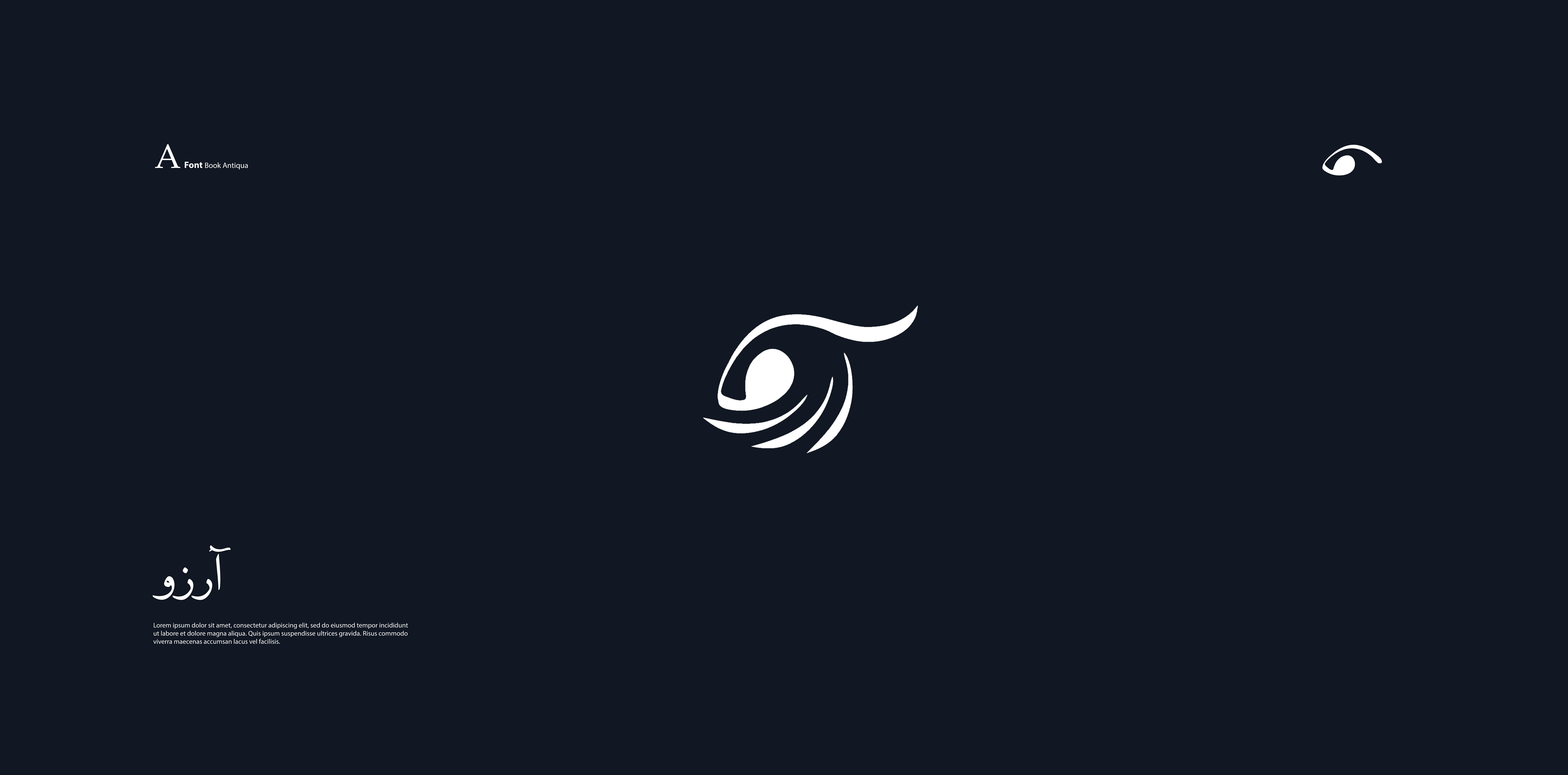
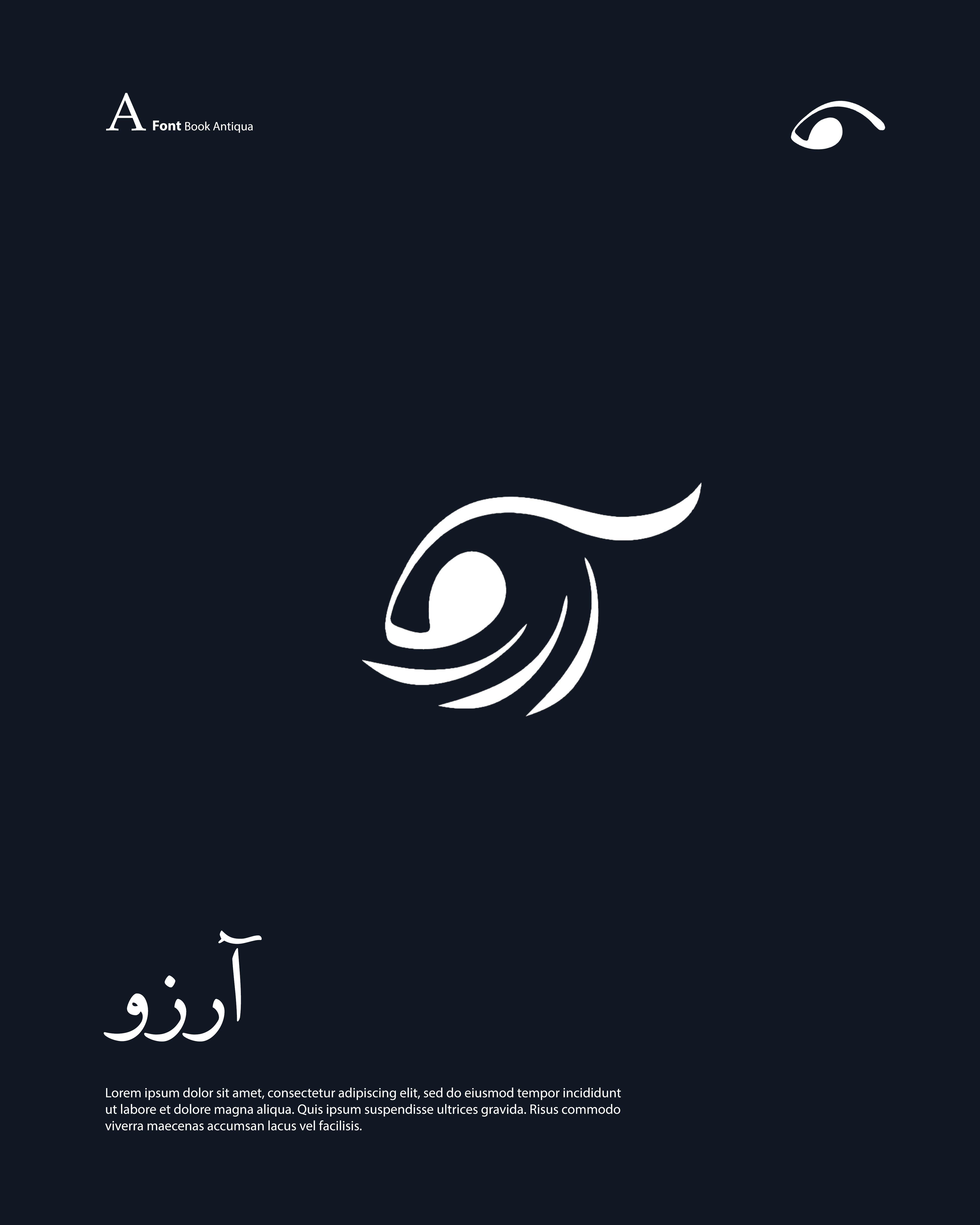
We created a complete brand identity for Arezoo's eyelash and eyebrow services, owned by Mrs. Arezoo, that positions the business as a premium beauty destination specializing in eye enhancement. The logo design features an elegant stylized eye illustration combined with flowing script typography that conveys femininity and precision. We developed packaging for retail products including eyelash serums, eyebrow gels, and beauty tools that use soft pink and gold color schemes with minimalist design aesthetics. Each product box includes a magnetic closure and soft-touch lamination that creates a luxurious unboxing experience customers will remember. We designed business cards using thick pearl-finish cardstock with rose gold foil accents that shimmer beautifully and leave a lasting impression. The packaging includes detailed product information, usage instructions, and before-after care tips that demonstrate expertise and build customer confidence. We incorporated QR codes linking to tutorial videos and booking systems, creating a seamless connection between physical products and digital services.
- + Elegant Logo Design
- + Luxury Product Packaging
- + Rose Gold Foil Business Cards
- + Magnetic Closure Boxes
- + QR Code Integration
- + Tutorial Video Links
Visual and typograpy hierarchy
Visual hierarchy is the principle of arranging elements to show their order of importance. Designers structure visual characteristics—e.g., menu icons—so users can understand information easily. By laying out elements logically and strategically, designers influence users’ perceptions and guide them to desired actions. Users notice larger elements more easily can convert.

- regular This is text message
- Medium Medium typography
- SemiBold Just Amazing
- Blod Awesome